Dear art lover,
It's early June, and the light has changed. This morning the sun came in so low and golden that one of the canvases on my wall suddenly seemed to breathe — colours that had been held back and almost whispering all winter now stood full and warm, glowing. I stayed there a moment, coffee in hand, and thought: this is why I love this season. Summer makes everything a little braver.
Maybe you feel it too. The windows open, the terrace comes alive, and all at once we dare a little more. More colour, more light, more room for what moves us. Where winter turns us inward, summer invites us to shine — and that's as true for our walls as it is for ourselves.
In this letter I want to take you straight into that feeling: daring to use colour, and the quiet power of nature on canvas. Two themes appearing everywhere this summer, and for me the very heart of conscious, artful living.
In the Spotlight
Nature in Abstraction: Why Organic Art Feels Like Coming Home
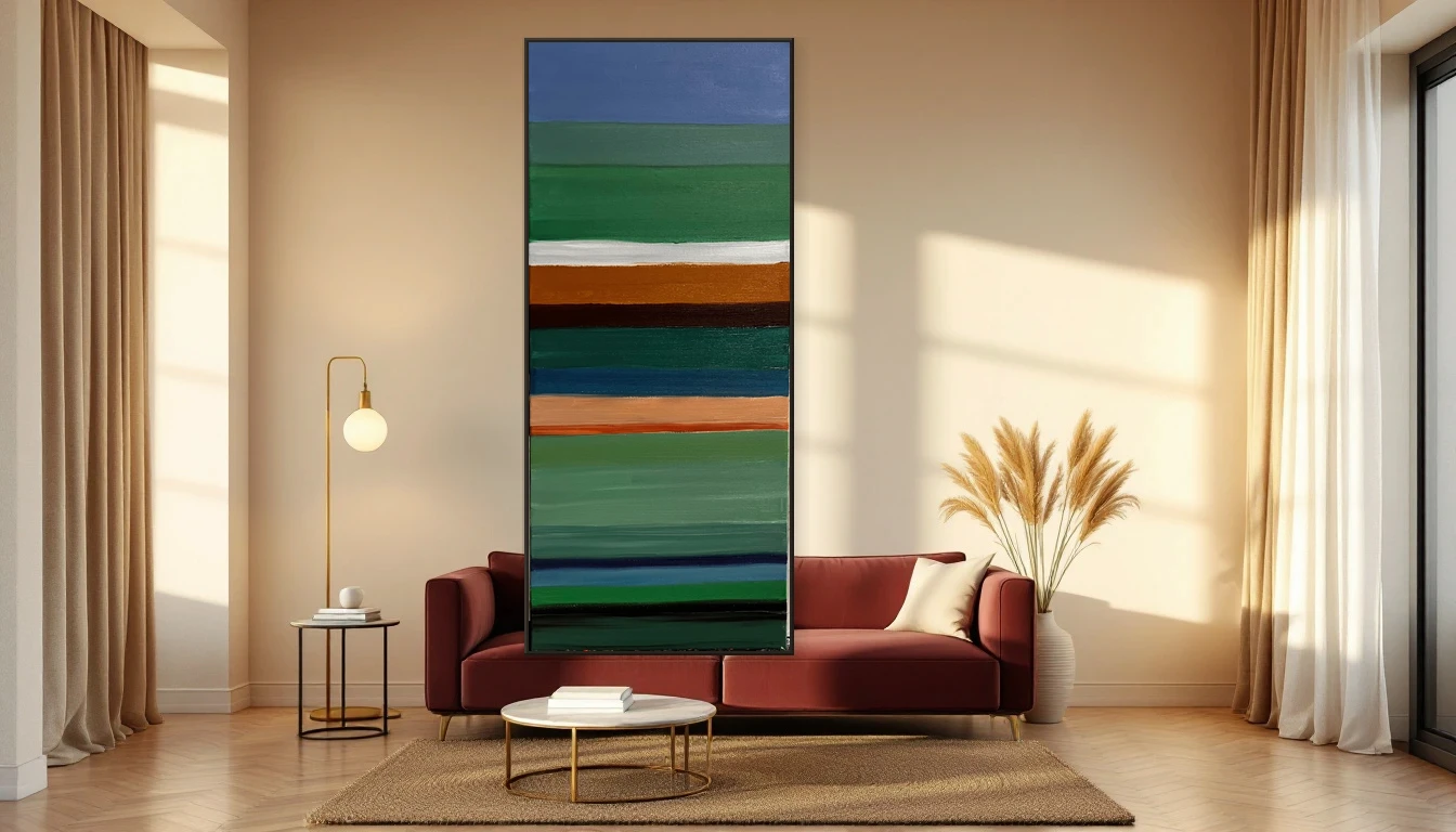
Organic forms and botanical abstraction are taking over our walls — and it's no coincidence. Something shifts in us when we look at soft, natural lines: our shoulders drop, our breath slows. In this post I share why art that brings nature indoors gives such deep calm, right when we're longing to be outside.
Read more →
Dare to Drench: Why Colour-Maxxing Makes Abstract Art Sing
The biggest interior trend of the year? Bold, saturated colour on your walls. And abstract art is its perfect companion. I'll show you how to embrace colour without it feeling busy — and how a single daring canvas can lift an entire room.
Read more →
Inspiration
What strikes me most this month across the interior world — from Elle Decoration to the major design desks — is that we're finally saying goodbye to cool, cautious neutrals. The summer of 2026 is warm and brave: terracotta, deep caramel, even ripe tomato red are appearing on walls, often through colour-drenching, where wall, frame and trim all bathe in one saturated tone.
At the same time I see a beautiful counter-movement: the rise of the biophilic living room and the wellness corner. Botanical abstraction on linen, soft landscapes, natural light and greenery — spaces that psychologically bring us back to nature. What I love is that these two don't fight each other. A warm, daring wall and an organic, calming canvas: colour that dares, art that breathes. That's exactly the balance DNH stands for.
Dinah's Tip
Want to play with colour this summer but not quite ready to paint a whole wall? Start small and smart: choose one bold artwork in a warm tone — terracotta, ochre, deep coral — and let that set the key. Then echo a single colour from the canvas in a nearby cushion, vase or candle. You create cohesion and courage without the risk. The eye reads calm, the heart feels the boldness. And when the urge grows: painting the wall behind it in that same tone makes it pure magic.
Looking Ahead
In the coming weeks I'll dive deeper into summer: how to turn your terrace into an outdoor gallery, and how to create a calm wellness corner at home with art that lets you breathe. I'm also working on a piece about building a colour palette that moves with the seasons. Keep an eye on your inbox — and in the meantime, savour that long, golden light.
With warm wishes and plenty of colour,
Dinah
DNH Artful Living