Newsletter: The First Choice
Dear you,
This morning I walked into my studio and stopped in the doorway. The May light fell differently than it did a week ago — slanted, golden, generous. It hit a canvas that had been leaning against the wall waiting for a new owner, and suddenly the painting seemed to come alive. New colours stepped forward. Shadows appeared that hadn't been there yesterday. And I thought: that's how art works. Not as decoration, but as something that breathes with the season.
May might be the gentlest month to look at your home with intention. The trees are full, the gardens in colour, the light is generous without being harsh. And in every interior magazine I leafed through this week — Homes & Gardens, Vogue, Elle Decoration — the same story keeps returning: the quiet, restrained luxury of last year is making way for something warmer, more layered, more personal. Lived-in luxury, they're calling it. A home that's been lived in, chosen, loved.
Over the past weeks I wrote three blog posts that all circled the same undercurrent — about the courage to choose one piece, about what stillness on your wall does for you, about how to begin when buying art is new to you. That theme won't let me go, and I think that's because as a culture we're ready for it. Ready to choose something slow again. Something with a hand in it.
Featured
In Your First Original: How to Start Collecting Art I tell the story of the woman who once stood in my studio and said, "This is it. I don't know why, but this is it." She'd never bought art before. No gallery experience, no art history degree — just a feeling. Two weeks later she sent me a photo of the piece above her dining table, morning light falling on it. That's how a collection begins. Not with money or expertise, but with the courage to listen to what moves you. Read more →
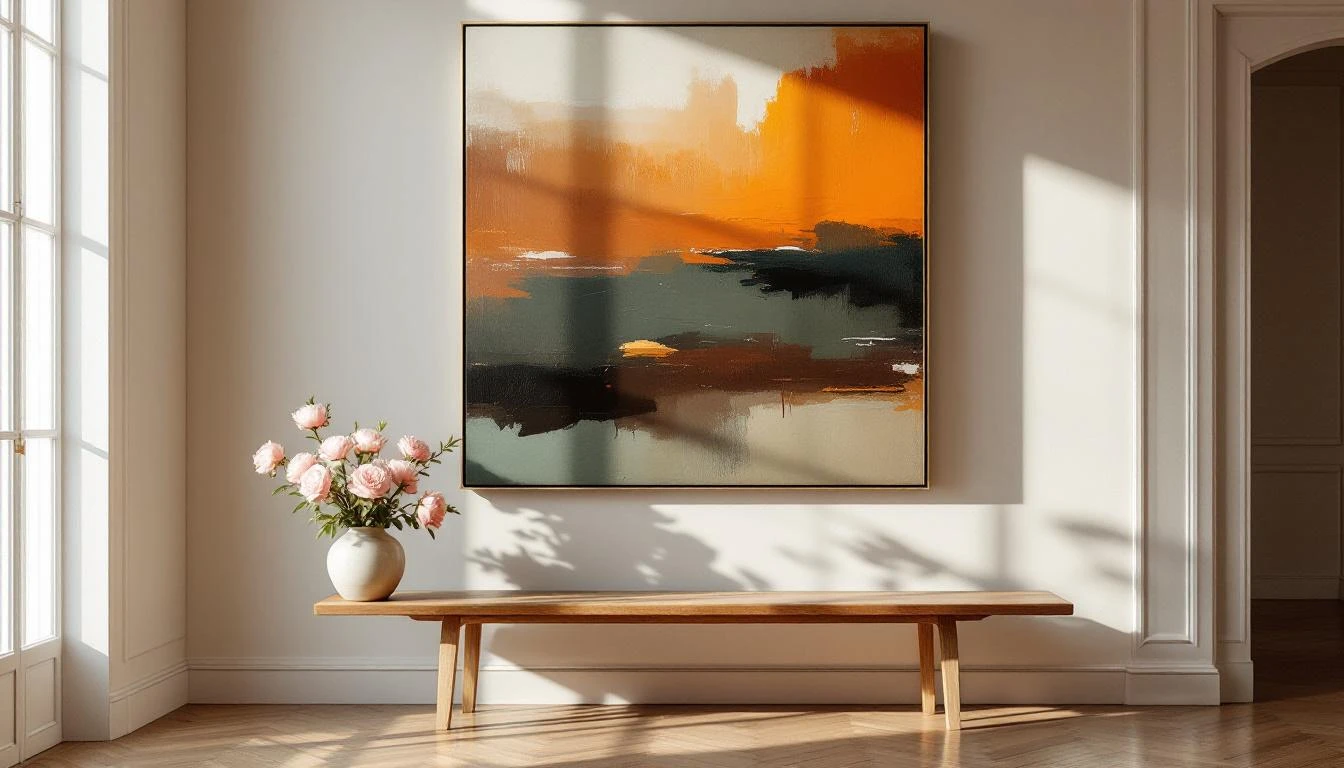
And in One Bold Piece: The Power of Oversized Art I wrote about why in 2026 I keep seeing more people choose one commanding canvas instead of ten small frames. Interior designers are calling it the most impactful styling move of the year — and once you understand why, you can apply it in your own home. With practical guidance on space, light, and how to feel whether a piece is right. Read more →
Inspiration: lived-in luxury, and what it really means
I can't say it often enough: there's a fundamental shift happening. Designers write it in every spring issue: away from the smooth, cool, polished interior — back to warmth, texture, and character. Sherwin-Williams announced a 2026 palette full of deep espresso, mossy green and toned neutrals. Houzz notes the comeback of warm browns and pistachio. Homes & Gardens uses the word patina as though it's the new luxury — and in a way, it is.
What does this mean for the art on your wall? Pieces with texture — thick paint, visible brushstrokes, relief — fit perfectly with this new aesthetic. They change with the light. They breathe with the room. They don't feel like a print but like something made. And that's exactly what we're craving: evidence of a human hand.
The Rijksmuseum is showing Metamorphoses through 25 May — over 80 masterpieces about transformation, featuring Caravaggio, Rodin, Bourgeois. If you're nearby, go. Not to buy art, but to train your eye. For what moves you. For what you hold on to.
Tip from Dinah
Do one thing this week: stand in front of a wall in your home — a place you pass often but never really look at. Maybe the landing. Maybe the hallway. Maybe the wall behind your dining table. Close your eyes briefly. Open them. And ask: what could hang here that would give me something every day?
Not what matches the colour scheme. Not what the styling blog suggests. But what brings you back to yourself on an ordinary Tuesday morning.
Remember: the centre of an artwork should sit at roughly 145–150 cm from the floor — almost always lower than instinct tells you. And give it breathing room. A piece drowning in furniture and accessories loses its power. One good choice, with space around it, is always stronger than ten mediocre ones.
Looking ahead
In the coming weeks I'm diving into something that's been quietly fascinating me: colour and season. How May light wakes up different colours in a canvas than November light — and what that means for the pieces you might want to choose before summer. I'm also working on a new series of smaller works for those who want to begin but aren't quite ready for a large statement.
And I'd like to talk with you sometime about art as an investment in wellbeing — not financial, but in how you feel. The World Health Organization now formally recognises arts engagement as a meaningful contributor to mental health. That's not vague wellness talk. That's science saying: looking at beautiful things changes you. I'd love to explore that here soon.
Until two weeks from now. Walk through your own home this week with different eyes. Not as a designer, not as a critic — just as someone coming home.
With warmth,
Dinah