Newsletter: Coming Home to Your Own Stillness
Dear you,
April is a strangely beautiful month. The days grow longer, the garden carefully colours itself green again — and yet I feel, and maybe you do too, a pull inward. Not hiding from the light, but making room for it to land softly. This morning I stood in my studio with a cup of tea, and realised that almost every blog I've written over the last two weeks has been circling the same longing: a home that breathes.
I think that's where many of us are quietly moving. Away from the sharp, away from the screen-light, away from the colours we once called 'modern' but that were really just cold. Towards something softer. Something that feels like it has known you for years. Interior stylists are calling it the grounded sanctuary — and they're right, but to me it isn't a trend. It's a homecoming.
This newsletter is a little map of the path I've been walking these last two weeks — with my brush, with my clients, and with myself. I hope there's something in it that resonates with you, too.
Featured: two pieces to read slowly
In Your Bedroom Sanctuary: Why Art Belongs Above the Bed I wrote about the most intimate room in the house — and why it's exactly where one well-chosen artwork makes the difference between a room and a real sanctuary. With practical notes on size, colour and hanging. Read more →
And in Slow Looking: Art as a Daily Ritual of Rest I share what last week's Slow Art Day stirred in me. Did you know the average museum visitor looks at a work of art for less than eight seconds? Shorter than a TikTok. About turning your wall into a daily place of rest. Read more →
Inspiration: the quiet return of earth
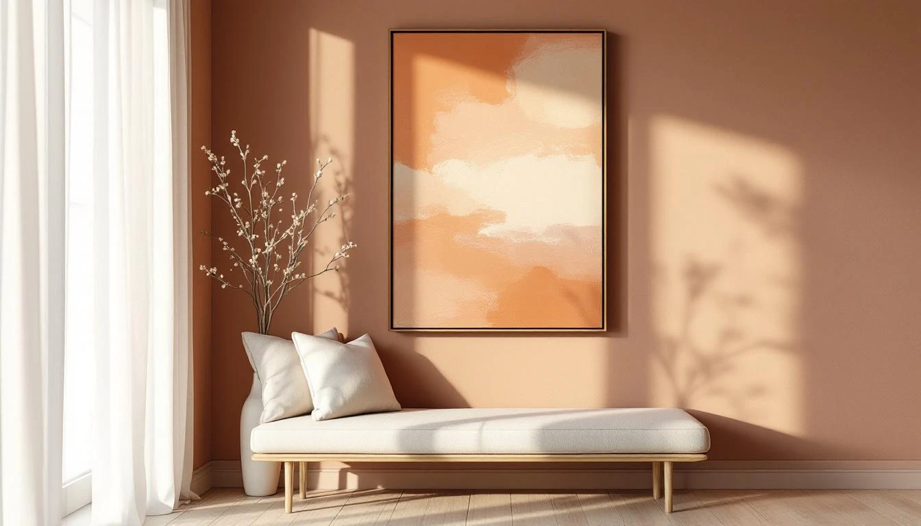
What keeps catching my eye in every interior magazine lately — Vogue Living, Elle Decoration, Homes & Gardens — is a warm earth-tone revolution. Cool grey is stepping aside for terracotta, moss green, and chocolate brown. Dulux chose an indigo blue as its 2026 Colour of the Year, specifically designed for bedrooms because it literally slows your heart rate. That isn't trend-talk — that's neurology on your wall.
What moves me most is the consensus among designers: we're turning away from anything that feels 'bright' or 'sterile'. The new luxury is warmth. A little nostalgia. The colour of clay, of sand, of an old book you've had for years. In my studio right now I'm layering a whisper of terracotta under almost every canvas — even under the blues. It gives everything the undertone of home.
Dinah's tip
If you change just one thing in your home this month: take a cool colour away and replace it with something warm. A cushion, a throw, a piece on the wall — anything. But do it deliberately. Grey has been the safe neutral for a decade. But a soft clay tone — warm white with a whisper of ochre — does exactly the same work, only with a hug in it. Look at your hallway, your bedroom, the wall behind your desk. One small swap, and the whole room will breathe differently.
Looking ahead
Over the next two weeks I'll be watching the spring with new eyes. A blog is coming about art and light — how the light of April differs from the light of June, and what that does to the colours on your wall. And I'm working on a series of smaller pieces made specifically for the corners of the home we usually overlook — the landing, the nook by the front door, the wall beside the hallway mirror. Smaller scale, same soul.
Until two weeks from now — try walking slowly through your own home. Pause at a place you usually hurry past. That's often the spot with something to tell you.
Love,
Dinah