Dear readers,
April has arrived. And I can feel it in the light.
I woke up early yesterday morning, made coffee, and stood at the window — and for a moment I just stopped. Spring light falls differently than it did in winter. More oblique, warmer, reaching deeper into the room. It landed on a canvas I’d been working on for the past few weeks, and suddenly I saw things in it I hadn’t planned. Colours that had grown lighter. Textures that seemed to step out of the paint.
That’s the magic of this season. Not just the natural world is changing — your home is changing with it. The works on your walls take on a new face. The colours you’ve looked at all winter suddenly breathe differently. It’s as if the light is rearranging your space without you having moved a single piece of furniture.
In my studio this spring, I’m working on a new series — inspired by the coast, by dune and sea palettes, by the way grey and green and sand blend together as the mist lifts off the beach. It feels like coming home. And I can’t wait to share it with you.
But first: two recent posts that generated a lot of response, an inspiring exhibition I’d love to recommend, and a small spring-rearrangement tip you can try today.
With warm regards,
Dinah
Featured: Recent from the Blog
Light Changes Everything: How to Make Art Come Alive
How daylight and smart lighting give your artwork a completely different character — and what you can do about it. From CRI values to the perfect moment of the day to see your art anew.
Nature on Your Wall: Why Abstract Art Feels Greener Than Plants
Biophilic design is the movement of 2026 — but it has long moved past plants alone. How abstract art with organic forms and nature palettes makes your home feel greener and calmer than any houseplant ever could.
Inspiration: Flowers, Colour and the Power of Impermanence
Have you visited Flowers Forever yet? At the Kunsthal Rotterdam (through late May), more than two hundred objects trace the world of flowers across art, fashion and design through the centuries. From 17th-century still lifes to contemporary fashion — flowers as symbols of love, power, grief and beauty.
What strikes me most about this exhibition is its underlying theme: impermanence. Flowers have short lives. Their beauty is temporary. And yet — or perhaps precisely because of this — they move us so deeply. That is the very essence of wabi-sabi, the philosophy I explored last month: finding beauty within transience.
The colour trends of this spring align perfectly with that feeling. Connecting Blue — a soft grey-blue radiating calm and clarity — and Transformative Teal have been named the defining colours of 2026 by leading colour institutes. Colours that are quiet but carry depth. Colours you breathe, not shout.
Dinah’s Tip: The Spring Rearrangement
One small move, one big difference: this week, rehang one piece of art in your home.
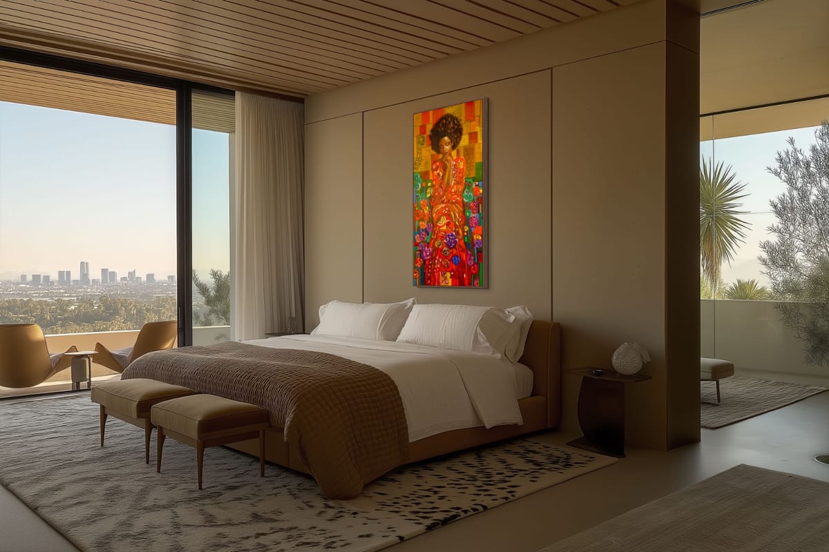
Not necessarily a different wall — just look at it again with fresh eyes. The April morning light falls differently now than it did in December. Follow it. Stand in the room at different times of day and notice where the light touches your work. Maybe you want to shift it slightly to the left. Maybe you hang it 10 centimetres lower than you’re used to.
And if in doubt: lower is almost always better. Centre point at eye level — around 150 cm from the floor — lets a work land far more naturally than hanging it too high.
Small adjustment. Completely different feeling.
Looking Ahead
In the coming weeks I’ll be writing about colour and emotion — why certain tones give you energy while others bring calm, and how to use that intentionally in your interior. I’m also working on a post about my new spring series: how coastal landscapes translate into abstract art.
And coming soon: a practical guide for anyone hanging their first piece of art at home. Because art is for everyone — not just for people with large budgets or large walls.
Until the next letter,
Dinah