
There's a drip of paint on one of my canvases that I almost covered up. A single, unplanned line that wandered across the surface while I wasn't looking. I left it. And now, weeks later, it's become the part of the painting I love most. Not because it's pretty, but because it's honest.
The Philosophy of Beautiful Imperfection
Wabi-sabi is a Japanese concept that finds beauty in transience, simplicity, and imperfection. It's the crack in a ceramic bowl that tells the story of its use. The uneven edge of handmade paper. The patina on a brass doorknob that's been turned a thousand times. It asks us to stop chasing perfection and start appreciating what's real.
In 2026, this philosophy has become one of the defining aesthetics in interior design. Design magazines and trendwatchers have highlighted the shift toward 'imperfect interiors' — spaces that feel lived-in rather than staged. And for those of us who work with our hands, it feels like the world is finally catching up.
Raw Textures, Real Spaces
The imperfect interiors movement goes beyond aesthetics. It's about choosing materials that age gracefully — linen that softens, wood that darkens, stone that wears smooth. It's about rooms that don't look like a catalogue but feel like a home.
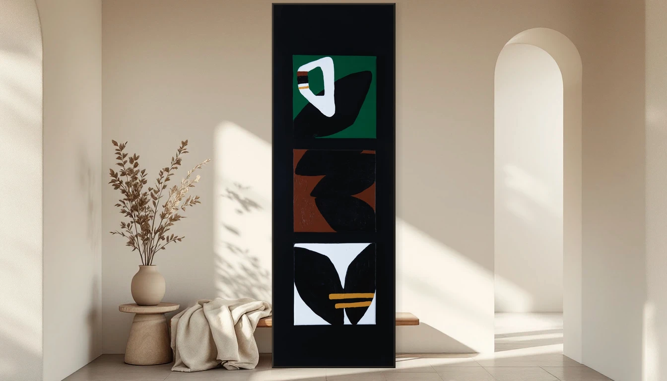
Art is central to this shift. Abstract paintings, with their unpredictable textures and organic forms, naturally embody wabi-sabi principles. A canvas with visible brushstrokes, layered pigments, and colours that shift with the light doesn't just decorate a wall — it breathes alongside the room.
Why Abstract Art Embodies Wabi-Sabi
When I paint, I work with the material rather than against it. Paint drips, pigment spreads in ways I can't fully control, and layers build up over weeks of adding and taking away. That tension between intention and accident is what gives abstract art its life.
Art market analysts point to a strong resurgence of abstract expressionism in 2026 — not the cerebral kind, but emotional, textured work that you can almost feel through the canvas. Collectors and designers are moving away from digitally produced prints toward original, handmade pieces that carry the energy of their making.
Earthy Tones for the Darker Months
As the Northern Hemisphere settles into its quieter season, there's a pull toward warmer, earthier palettes. Ochre, burnt sienna, deep umber — these are colours that connect us to the ground beneath us, to clay and bark and autumn soil. They're the colours of wabi-sabi: understated, grounding, quietly powerful.
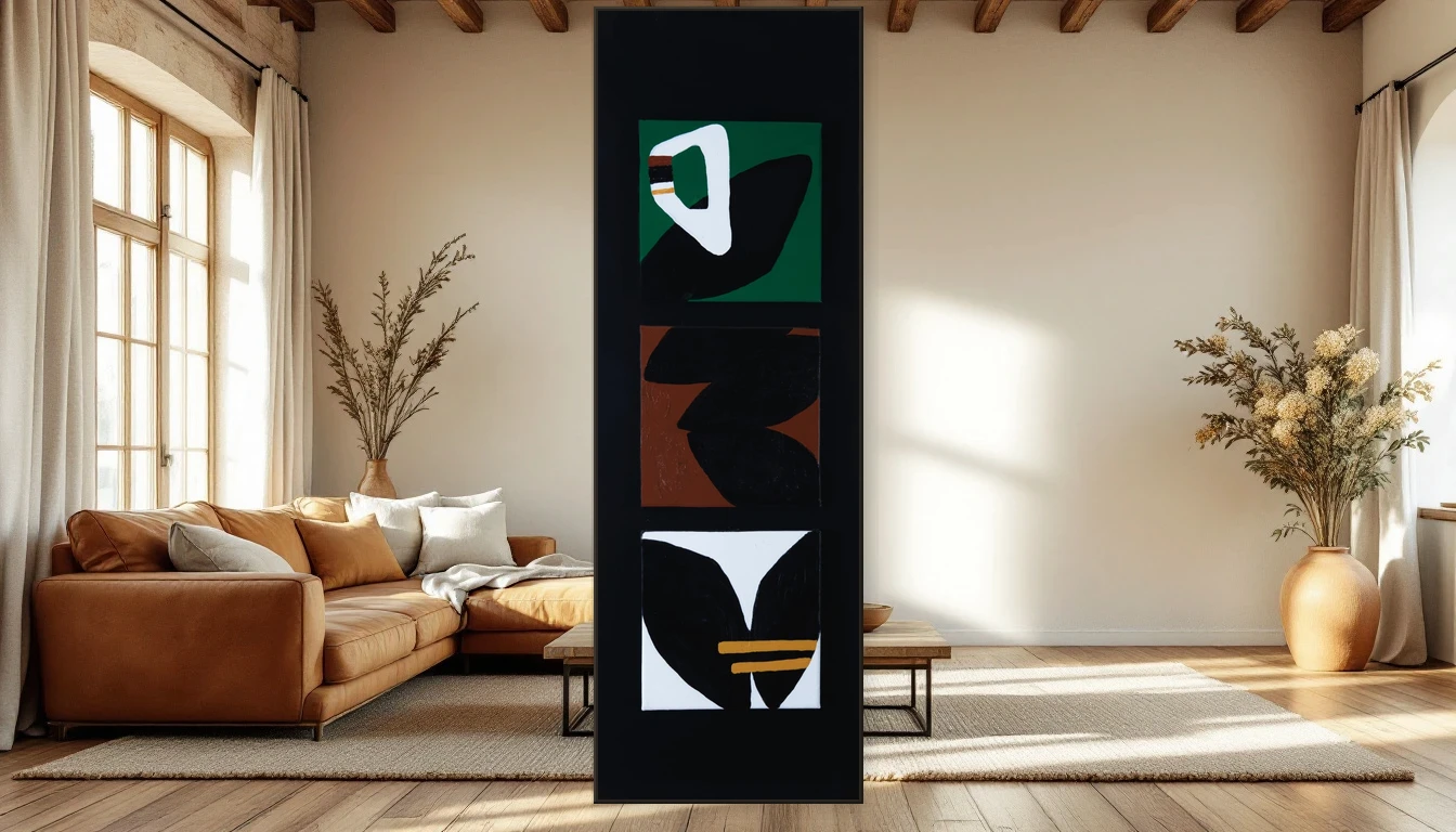
My Ethnic Brown triptych captures exactly this feeling. Three panels that speak of texture and earth, of the beauty found in layers and irregularity. It belongs in a room with worn leather, aged timber floors, and the kind of light that comes through linen curtains on a November afternoon.
Live With Art That Lives
Here's what I'd love you to try: look at your walls not as surfaces to fill, but as spaces to have a conversation with. Does the art need to match the sofa? Or could it be the thing that gently disrupts the room and makes it more interesting?
The most beautiful homes I've seen weren't designed — they evolved. And the art on their walls wasn't chosen to be perfect. It was chosen because it felt right.
Explore the Abstracts collection or reach out for a personal recommendation. I'd love to help you find a piece that's as beautifully imperfect as life itself.