
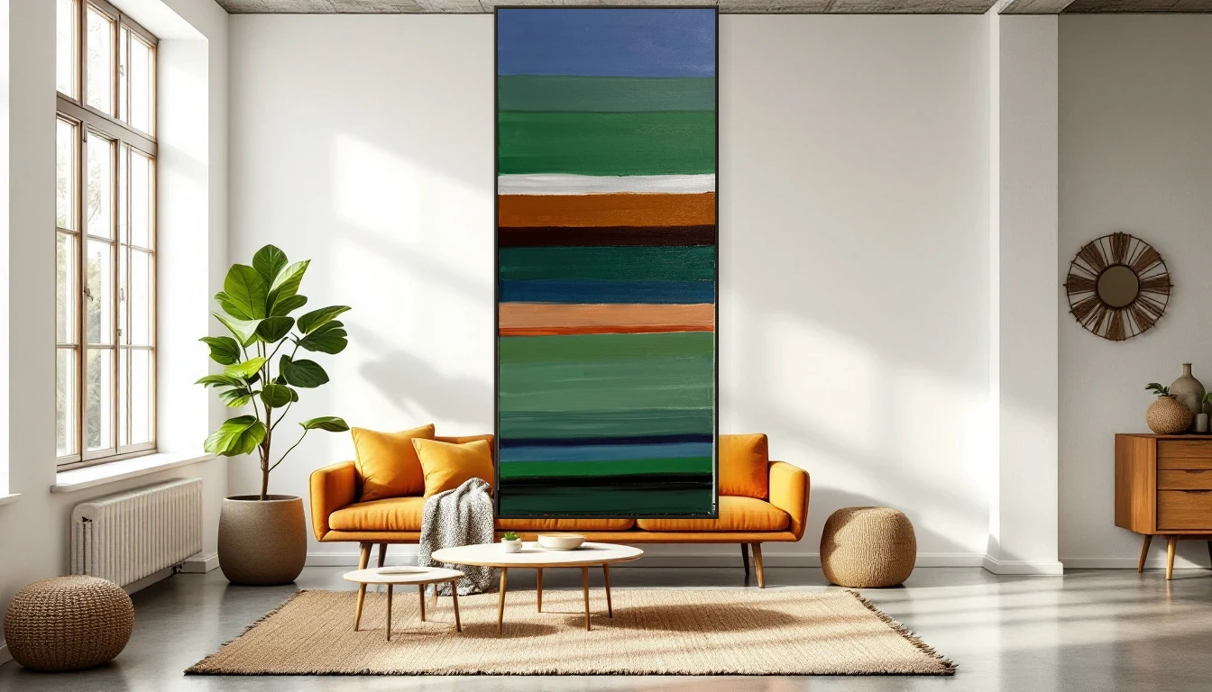
Your brain on colour
Something happens every time I step into my studio. When I reach for deep blues and greens, my breathing slows. When I grab vibrant yellows and corals, I feel a shift — like someone turned up the volume inside my head. For years I thought it was just me. Then I discovered the science of colour psychology, and realised we all respond this way. It is wired into us.
The neuroscience of colour response
Researchers have established that colour directly affects our nervous system. Warm hues — red, orange, golden yellow — activate. They slightly raise your heart rate and encourage conversation. Cool hues — blue, sage green, lavender — do the opposite. They lower cortisol levels and invite introspection. This is not some vague wellness trend. It is neurology, and it has real implications for how we curate our living spaces.
Red and orange: the social colours
In dining rooms and living areas, artwork with red and orange tones can literally warm the atmosphere. These are the colours of connection and gathering — there is a reason restaurants around the world lean into this palette. An abstract piece with warm undertones brings a quiet energy to any room where people come together.
Blue and green: your personal sanctuary
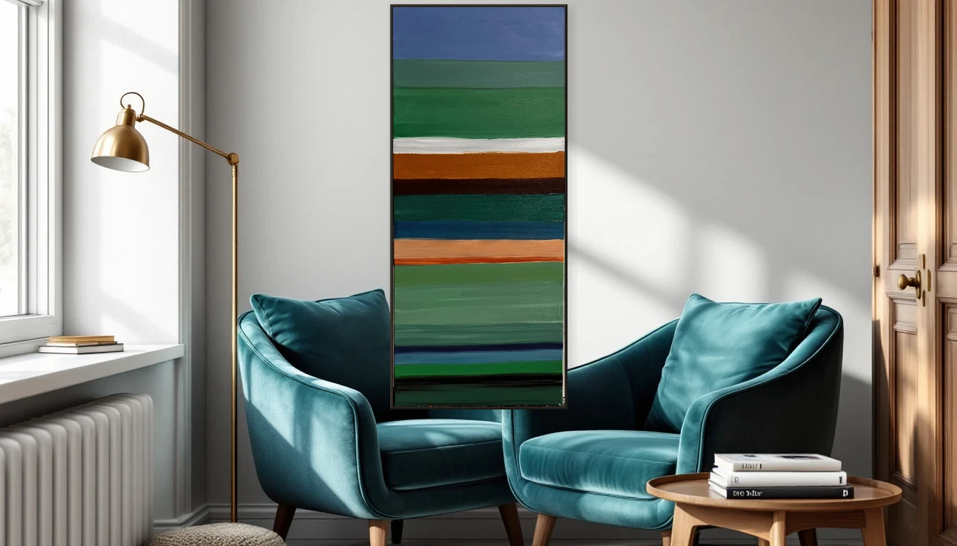
For bedrooms and reading corners, blue and green tones are your closest allies. Colour psychologists call this creating a 'visual anchor' — a resting point where both your eyes and your thoughts can settle. Recent studies suggest that people in rooms with blue-toned art report feeling up to 15 percent more relaxed.
Yellow: the creative spark
Yellow is the colour of optimism and mental clarity. In a home office or creative workspace, artwork with yellow accents can sharpen your focus and lift your mood. Your brain associates yellow with daylight and fresh ideas. But nuance matters enormously here: a soft ochre works very differently from an electric neon.
The power of colour combinations
The real magic happens when colours work together. A painting that blends warm and cool tones — say, vivid turquoise beside warm coral — creates what I call 'dynamic balance.' You feel energised and grounded at the same time. This is exactly why I love colourful abstract work: it speaks to multiple emotions simultaneously, creating a richer experience than any single hue could.
Choosing art by feeling, not just looking
Here is my advice: next time you stand before a piece of art, pay attention not to what you think of it, but to what you feel. Where in your home would that feeling belong? The energetic abstraction might not suit your bedroom, but it could transform your dining space. Trust your body — it understands colour faster than your mind does.
Your home as an emotional landscape
Every artwork you hang tells a story in colour. Not just to you, but to everyone who walks through your door. When you become intentional about this — the right colours in the right places — your interior becomes more than beautifully styled. It becomes a space that actively supports how you want to feel, every single day.