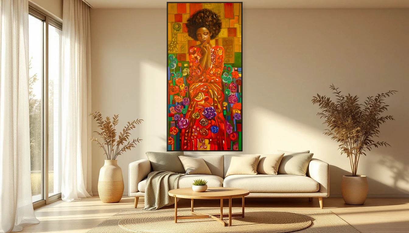
Yesterday I stood in my studio looking at a canvas I had just finished. Warm gold, deep red, an undertone of olive green. I noticed my shoulders dropping. My breathing slowing. And I thought: this is not a coincidence. This is colour doing what colour does.
Your Walls Talk to Your Nervous System
We know it intuitively: a room can calm you or unsettle you. But science now shows us why. Researchers in neuroaesthetics measure what happens when you look at art. Your heart rate shifts. Your cortisol drops. A 45-minute gallery visit lowers your stress hormone by over 30 percent. This is not wishful thinking. It is biology.
Why Abstract Art Works So Well Here
With figurative art, your brain has work to do: what does it depict, does it make sense, what is the story? Abstract art makes no such demands. There is no object to label, no narrative to follow. Your nervous system does not need to stay alert. It can soften. And that release is exactly what an overstimulated body needs.
The 2026 Colour Palette: Built for Wellbeing
This year, interior colour is not about fashion. It is about feeling. WGSN named Transformative Teal as colour of the year -- a deep blue-green that stands for resilience and balance. Alongside it, we see soft sage, warm terracotta, muted gold everywhere. These are colours that speak to our biophilic wiring: they mimic nature, and that makes us calm. Research shows green tones lower cortisol and sharpen focus. Warm earth tones activate your parasympathetic nervous system -- the system responsible for rest and recovery.
Colour as a Daily Ritual
You do not need to visit a gallery to experience this. A well-chosen painting in your living room, hallway, or workspace does the same thing. It works as a visual anchor -- every time your eyes pass over it, it sends a signal: you are safe here. You may breathe.
I notice it in myself. The works I hang in my own home are not chosen to match something. I choose them for what they do to me. A canvas with deep, warm tones above my desk helps me focus. A softer piece in the bedroom helps me let go.
Choose from Feeling, Not from Trend
The most beautiful spaces I know are not the most styled. They are places where someone dared to listen to what a colour did to them. Where the painting was not matched to the sofa, but to the feeling they wanted when they walked through the door.
That is what colour can do: turn your space into a place that takes care of you. Not with words, but with light, pigment, and texture.
It Starts with Looking
Stand in front of a painting sometime. Not to analyse it, but to feel. What does it do to your breathing? Where do you relax? Which colours draw you in? The answers tell you more about what you need than any interiors magazine ever could.
Colour is a Language
In my work, I use colour as a language you do not need to translate to understand. Gold for inner richness. Red for life force. Green for connection to the earth. That language speaks directly to your body, past your thoughts. And that is exactly why art at home is more than decoration. It is self-care, every single day.
Curious which colours your space needs? Browse the collection or get in touch. I would love to help you find the right piece.