
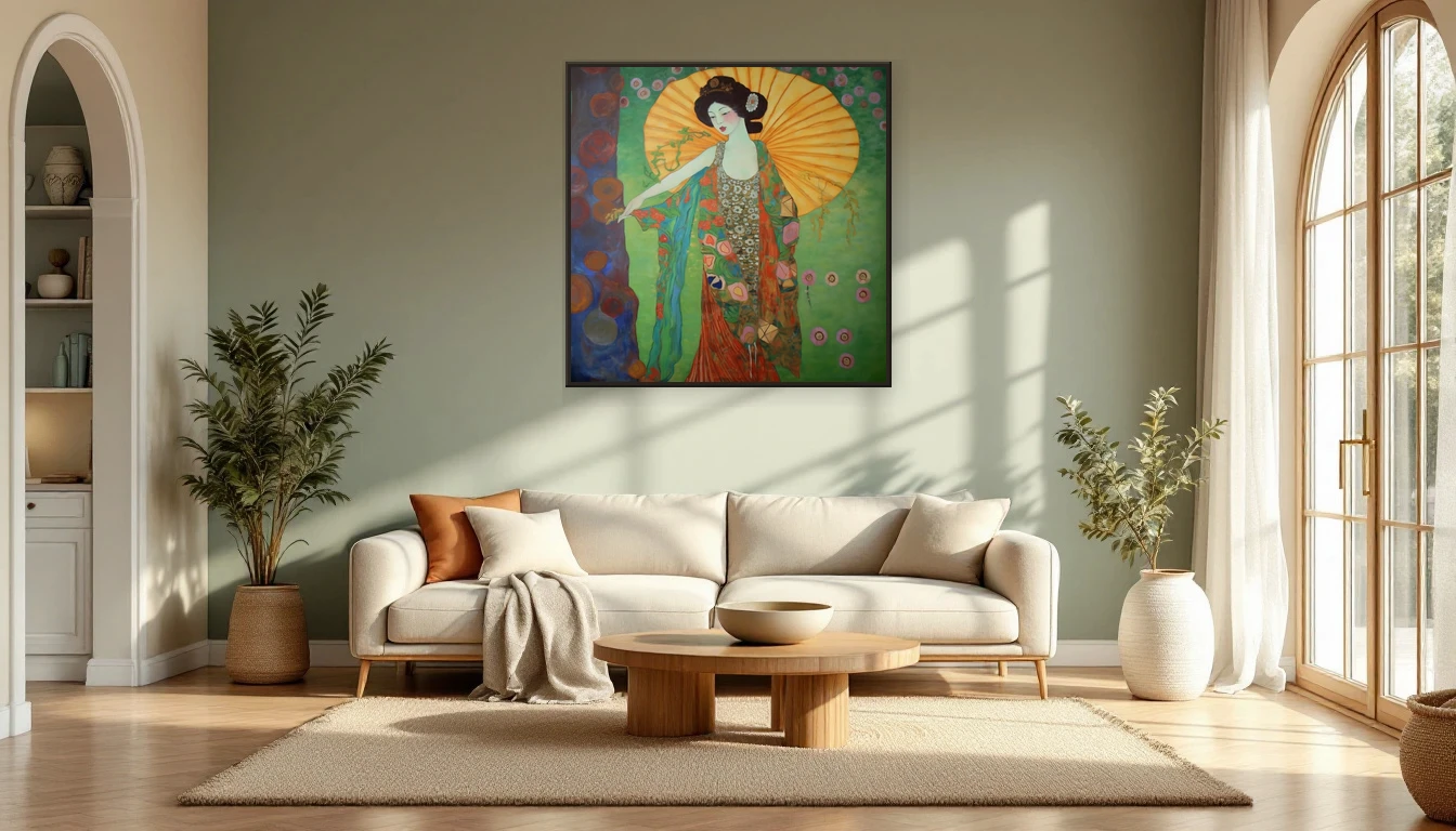
There are moments in my studio when I catch myself staring at a canvas for ten minutes straight. Not thinking about composition or brushwork — just feeling the colours. A deep teal that steadies my breathing. A warm ochre that feels like coming home. Colour isn't decoration. It's a language your nervous system speaks fluently.
The Science of Colour and Emotion
What artists have known instinctively, neuroaesthetics is now confirming with data. Researchers have shown that colours measurably alter brain chemistry and emotional states. Warm hues like ochre, terracotta, and rust activate feelings of comfort and optimism. Cool tones — blue, green, sage — promote calm and reflection. This isn't folklore. It's biology.
Transformative Teal: 2026's Defining Colour
Colour authorities WGSN and Coloro named Transformative Teal the colour of the year. This deep blue-green sits at the intersection of nature and innovation, stillness and movement. In an interior, teal acts as an anchor: it draws the eye, slows the breath, and creates a space that invites pause. It pairs beautifully with abstract art in earthy palettes — which is no coincidence.
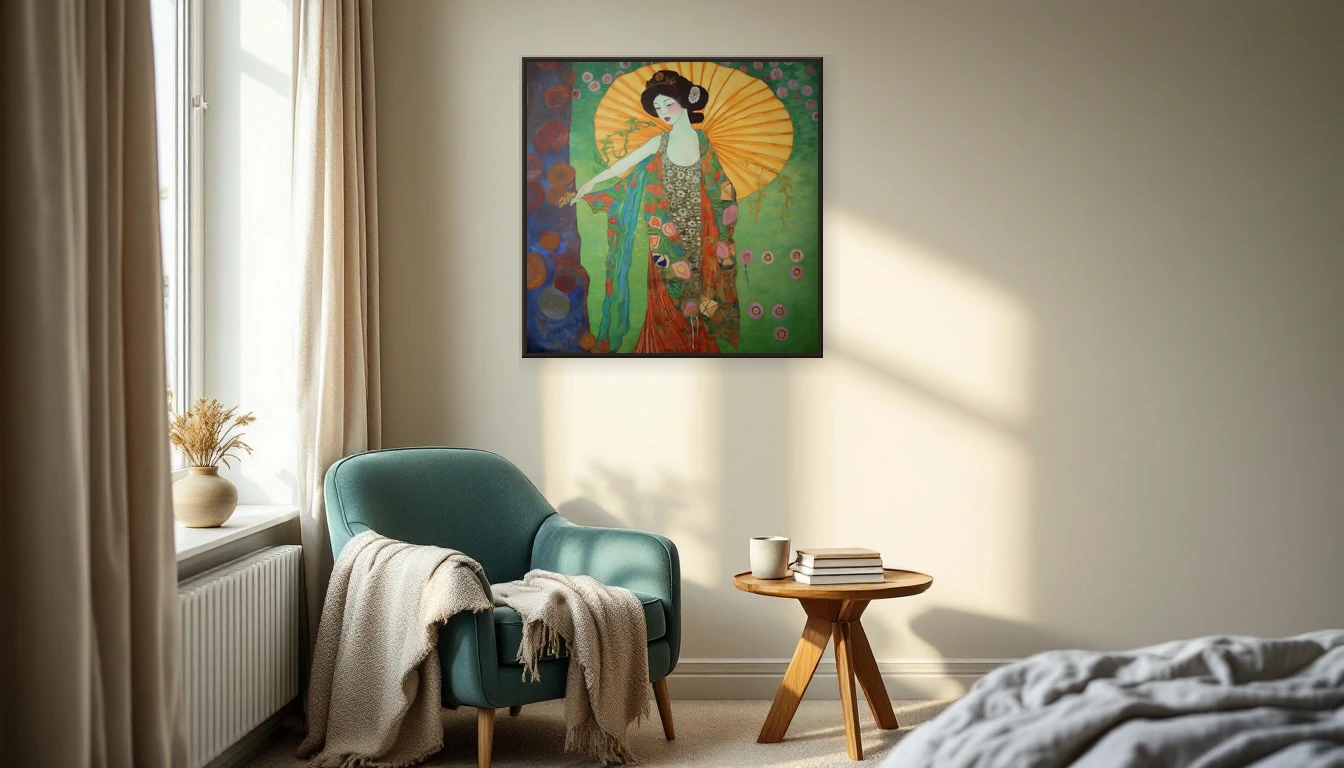
Why Abstract Art Gives Your Brain a Rest
Figurative art tells you what to see. Abstract art asks an open question. That difference matters for your wellbeing. Without recognisable images, your brain shifts from analysing to feeling. Your eyes wander freely across shapes and colours without the pressure to identify anything. Neuroscientists call this default mode network activation — the same brain state as meditation.
Your Colour Palette as Self-Care
Interior design in 2026 is moving toward colours with emotional depth. No harsh contrasts, but tones that tell a story: clay, warm brown, olive green, soft sage, deep indigo. These earth tones create what designers call haptic luxury — spaces that are not just beautiful but physically calming. An abstract painting in the same tonal family as your room becomes less of a decorative accent and more of a daily source of quiet.
Choosing Colour with Intention
When I start a new piece, I don't choose my palette at random. I ask myself: what feeling should this canvas hold? Calm? I reach for cool greens and muted blue-greys. Energy? Warm corals and golden ochres come out. You can apply the same intention when choosing art for your home. Don't just ask whether a painting matches your sofa — ask whether it matches how you want to feel.
The Power of Tonal Harmony
Interior stylists in 2026 talk about tonal families — rooms where walls, textiles, and art belong to the same colour temperature. A painting with warm earth tones beside a linen sofa and oak floor creates a coherence that your brain registers as safe. That subtle harmony lowers your stress response without you consciously noticing why you feel so settled.
Art as a Daily Ritual
The beauty of a painting on your wall is that it's always there. No app to open, no exercise to remember. Every time your gaze drifts across the canvas — morning coffee, evening lamplight — is a micro-moment of mindfulness. The colours do their work, quietly and consistently.
Building Your Own Healing Palette
Start with yourself: which colours draw you in? Not what's trending, not what coordinates with the curtains, but what your body chooses when you stop overthinking. That instinctive pull is your compass. Choose a painting that speaks those colours and give it a prominent place — at eye level, where you'll see it every day.
Curious which colours suit you? Explore the DNH collection and discover which piece enriches both your space and your sense of calm. Or get in touch — I'd love to help you find the colours that make your home feel right.