
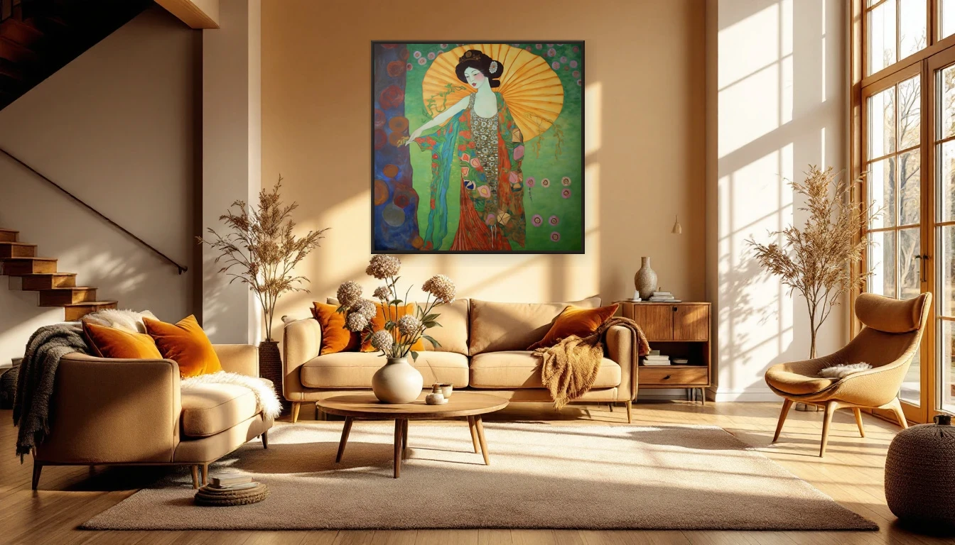
When the light begins to turn
There’s a shift happening — subtle, but unmistakable. The afternoon sun sits lower, casting longer shadows and painting rooms in amber. Late summer slides into early autumn, and with it comes an instinct to nest, to gather warmth around us.
I notice it in my studio first. The cool blues and seafoam greens I mixed in June suddenly feel out of step. My hand reaches for ochre, burnt sienna, deep olive. My palette follows the seasons before my mind catches up.
The colour shift reshaping interiors in 2026
This year’s design world has spoken with unusual clarity: warm is in. Cool greys have stepped aside for earthy palettes — burgundy, rust, caramel, mustard, and mossy greens. Homes and Gardens calls it “personality, pattern, and patina.” Pinterest’s trend forecast highlights cocooning as one of the defining movements: homes designed as protective nests of layered texture and warm light.
But here’s what most styling guides miss: art drives the emotional temperature of a room more than any throw pillow or candle. A painting in warm golds and organic greens anchors a space, giving all those cosy layers something to orbit around.
Why abstract art anchors the seasonal shift
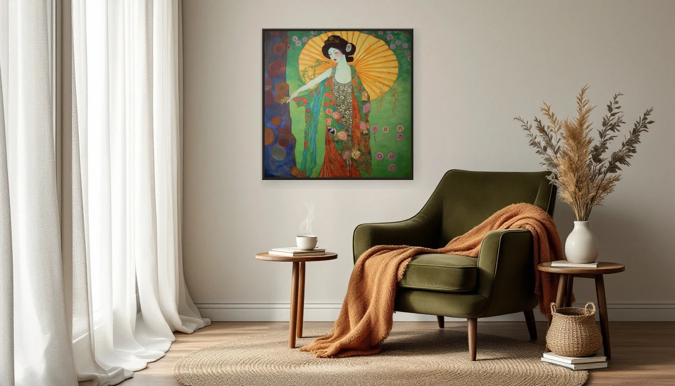
When you swap your summer linen for a heavier throw, something shifts in your room’s balance. The art on your wall either leads that shift or resists it. Abstract works with earthy, organic palettes — think golden yellows, olive greens, bronze, and caramel — naturally bridge the gap between light-filled summer and the moodier warmth of autumn.
It’s the same principle nature uses. Late summer meadows don’t snap from green to brown overnight — they soften through gold, rust, and amber first. Art that mirrors this transition feels effortless. A work like Klimt Abstraction captures exactly this: the warmth of a Tuscan afternoon filtered through pattern and texture, nature reimagined as decoration.
Three ways to let your walls lead the transition
Shift your lighting first. Replace cool-white bulbs with warm alternatives. Add candles in ceramic holders. Warm light deepens the golds and ambers in your art, making the same painting feel entirely different after sunset.
Layer your textures. A linen throw, a wool cushion, a sheepskin on the floor — these tactile elements echo the organic forms in abstract art. Together, they create the sensory richness that autumn interiors crave.
Bring nature indoors. Dried hydrangeas, eucalyptus branches, ornamental grasses in an earthenware vase. Placed near a painting with natural tones, they blur the line between art and the world outside your window.
Let your walls breathe with the season
The shift from summer to autumn isn’t a rupture — it’s a slow exhale. Let your home breathe with it. A painting in the right tones makes that transition visible, tangible, something you feel every time you walk into the room.
Curious which work suits your autumn? Explore the collection or get in touch — I’d love to think along with you.