
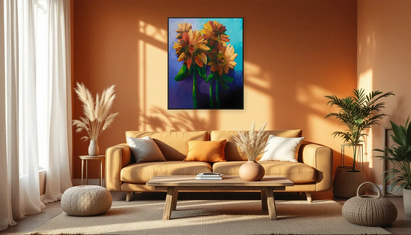
A client stood in my studio last week, torn between two paintings. One was all deep ocean blue; the other blazed in warm earth tones. "Which one goes with my sofa?" she asked. My answer: forget the sofa — which one goes with how you want to feel?
Colour Talks Before You Think
We respond to colour before we're consciously aware of it. That's not a hunch — it's neuroscience. Research shows that blue physically lowers your heart rate and blood pressure. Your body downshifts, just by looking. Warm hues like red and orange do the opposite: they activate, stimulate, wake you up. And earth tones — ochre, sienna, terracotta — work as anchors. They ground you, creating a sense of safety and calm.
That's exactly what happens when a painting hangs on your wall. It isn't just decoration. It's a daily colour signal that your nervous system registers every time your eyes pass over it.
The Autumn Palette Your Home is Asking For
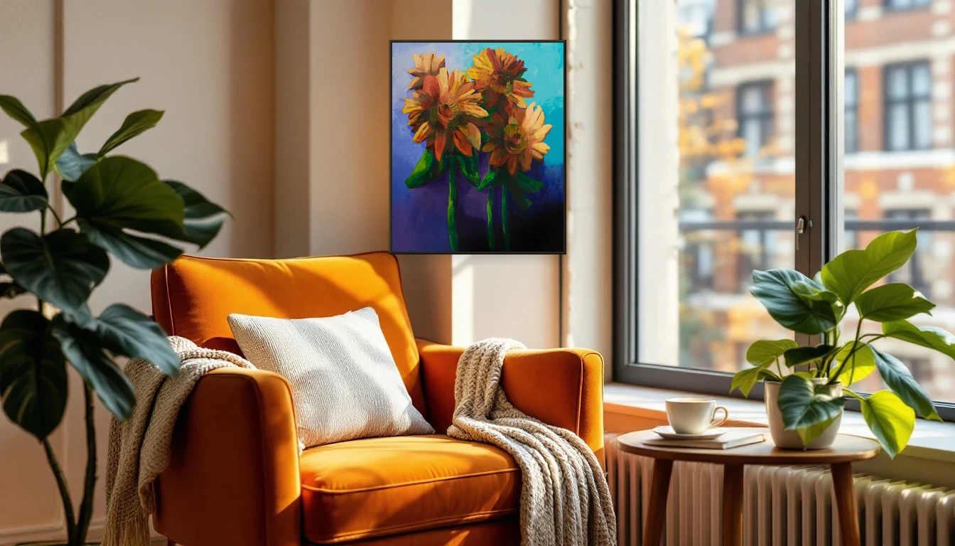
Pantone's Colour of the Year for 2026 is Cloud Dancer — a soft, balanced white that breathes space and serenity. It says something about what we collectively need right now: calm in a world that won't slow down. But a white backdrop is just that — a backdrop. What you place on it sets the tone.
This autumn, the design world is embracing warm earth tones layered with muted accents. Terracotta, mustard, burgundy, and moss green dominate European interiors. These aren't arbitrary — they mirror what's happening outside as leaves turn and light drops lower. That's biophilic design at work: aligning your surroundings with nature, because your brain reads that as rest.
Choose for Feeling, Not Matching
The biggest mistake people make when choosing art? Colour-matching to the cushions. A painting doesn't need to coordinate with your throw pillows — it needs to do something to you. Looking for evening calm? Lean toward deeper, cooler tones. Need energy in a workspace? Warm accents in ochre and rust lift the atmosphere instantly.
With abstract art, this effect is even stronger than with figurative work. There's no subject to distract you — you're responding purely to colour, form, and movement. That direct, intuitive connection is exactly why abstract paintings are so powerful in a home setting.
Science Confirms What Artists Always Knew
The World Health Organization recognises arts engagement as a contributor to mental health. Neuroscience research shows that looking at art with warm, rich palettes lowers cortisol and can trigger a state of flow. Cognitive studies find that soft earthy tones reduce mental fatigue and restore emotional balance.
None of this is coincidence. It's why a well-chosen painting doesn't just brighten a wall — it changes how you feel at home.
Find Your Colour
Curious which colours suit your space and mood? Browse the DNH collection — from deep oceanic tones to warm autumn palettes. Or get in touch for personal colour advice. Together, we'll find the piece that doesn't just look right — it feels right.