Something shifted in my studio last week. I was layering pigments — a deep cadmium red meeting ultramarine — and what emerged was this rich, enveloping purple that felt exactly right for the season. Not the bright purple of decades past, but something warmer, earthier, more grounded. It turns out, the design world agrees.
From the runways of Loewe and Celine to the pages of Homes & Gardens and Architectural Digest, the message is clear: purple is the defining colour story of autumn 2026. And for anyone who lives with art, this opens up exciting territory.
Why Purple, Why Now?
For several seasons, warm interiors relied on terracotta, rust, and ochre. Beautiful tones, but familiar. Purple offers something different — it carries the depth of traditional autumn colours while adding a layer of intrigue. It reads as warm and cool simultaneously, sophisticated yet inviting. That tension is precisely what makes a room memorable.
The Shades That Matter
Forget neon violet. The purples leading this trend are muted, earthy, and remarkably elegant. Aubergine — deep, almost brown, like the skin of a ripe fig. Mulberry — softer, with a warmth that recalls late autumn evenings. Plum, grape, nightshade. These are colours that create space for stillness, and that makes them powerful in a home.
Why Abstract Art and Purple Belong Together
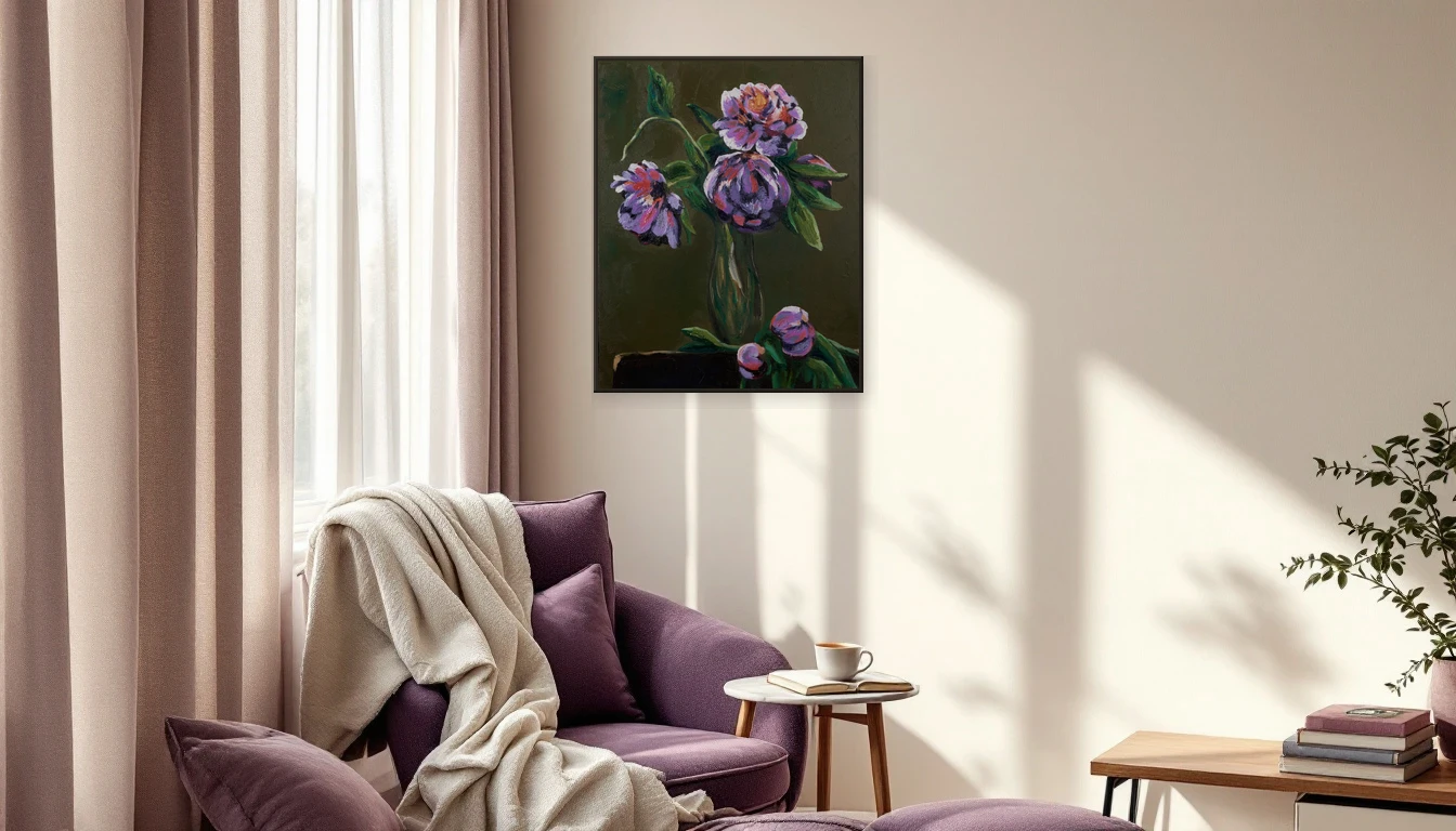
This is where things get truly exciting for me as an artist. Purple is one of those rare colours that gains complexity in abstract work. The way violet layers move across warm undertones, how light interacts with pigment — it creates a visual depth that few other colours achieve. An abstract piece with purple tones becomes something meditative: it invites feeling over analysis.
How to Bring Purple Home
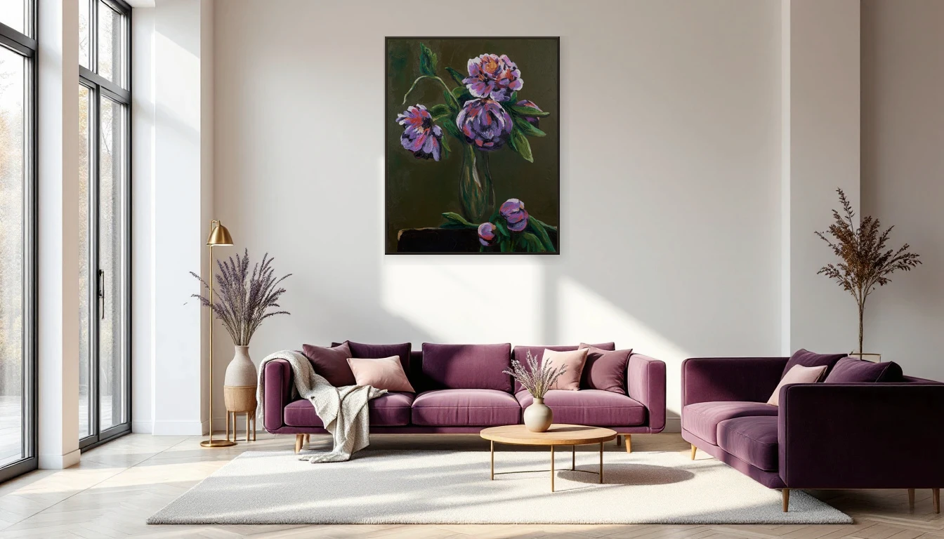
You do not need to repaint an entire room. My advice is always the same: let art lead the way. A painting rich in aubergine or mulberry tones gives your space an instant anchor point. Pair it with warm neutrals — sand, cream, soft grey — and the result feels like a room that has always had a soul.
The Texture Connection
Purple does not live in isolation this season. The trend coincides with a return to decadent materials: silk velvet, mohair, embroidered fabrics. These textures amplify the colour beautifully. A velvet cushion in plum beside an abstract painting with the same undertones — that is the kind of layering that elevates a space from attractive to unforgettable.
Dutch Design Leads the Way
With Dutch Design Week approaching (17-25 October in Eindhoven), the purple palette is visible across Dutch experimental design. Designers are working with pigments, bio-based textiles, and light installations in this very colour family. It confirms what the runways already told us: this is not a passing fad but a genuine shift in how we relate to colour.
What Purple Does to Your Mind
Colour psychology tells us purple stimulates both calm and creativity. It is the colour of reflection, of that moment when day transitions into evening. In a living room or bedroom, this quality is extraordinary — it makes space for thought without creating overwhelm.
Unexpected Combinations
Dare to pair purple with tones you might not expect: warm mustard, deep forest green, or copper accents. The contrast enriches both colours. In my studio, I have found that the most compelling results emerge when colours challenge each other rather than simply coordinate.
Start With the Wall
Want to explore the purple trend? Begin with art. A single abstract work in aubergine or mulberry tones can transform an entire room — no paint, no renovation required. Browse the DNH Artful Living collection and discover which piece brings your walls to life. Or get in touch for a personal consultation — I am always happy to help you find the perfect match.