Yesterday afternoon I was mixing paint in my studio. Ultramarine, a drop of black, a breath of white. The blue that appeared was not the blue I was looking for — it was better. Deeper. Quieter. The kind of blue you disappear into if you look at it long enough. I put my brush down and did exactly that. Five minutes. Maybe longer.
Why blue is having its moment
Every interiors publication I have opened in the past few weeks tells the same story. Homes & Gardens calls blue one of the most unexpected yet confident colour choices of spring 2026. Jotex names it the clear favourite for the season. And across the Dutch design scene, the soft, muted blues we know from old Delft porcelain and forgotten window shutters are making a quiet return.
This is not coincidence. After years of warm earth tones — the terracottas, the camels, the ochre browns — there is a longing for a colour that does not wrap around you but opens up space. Blue does that. It pushes walls backward, makes a room feel larger than it is, gives your eyes somewhere to rest.
What blue does to your brain
There is science behind the feeling. Colour psychology research shows that blue tones lower heart rate and reduce cortisol production — the hormone your body releases under stress. Dulux chose a deep indigo blue as their 2026 Colour of the Year, aimed specifically at bedrooms and spaces designed for recovery. This is no longer decoration. It is neuroscience on your wall.
In my own studio I notice it every time. A canvas dominated by warm tones pulls people closer — they want to stand near it, touch it. A work with blue does the opposite: it invites you to step back, to take in the whole composition, to breathe deeply. Both responses have value. But in a time when most of us are searching for breathing room, blue is precisely the colour we need.
Blue in abstract art
Abstract art and blue share a long history. Think of Yves Klein, who named an entire pigment after himself — International Klein Blue — because he believed blue was the most immaterial colour. Or the colour field painters of the 1960s, where a single blue plane was enough to tell a complete story.
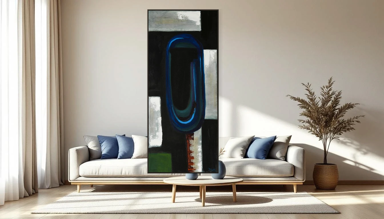
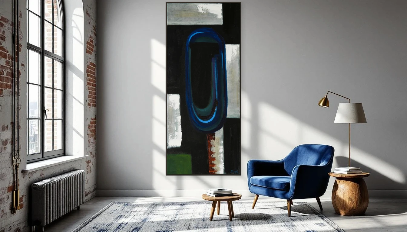
What fascinates me is how blue behaves differently from other colours on canvas. Red leaps forward, yellow demands attention, but blue recedes. It creates depth where none exists. In my painting Ethnic Blue you see this most powerfully: the deep, electric blue arc at the centre seems to emerge from darkness, like a gateway to something beyond. That illusion of space — that is the power of blue.
Three ways to bring blue home
You do not need to paint a wall to bring blue into your interior. In fact, for most rooms, art with blue works more effectively than a painted surface. A painting carries not one blue but ten — from the palest grey-blue to the deepest midnight. It lives, it shifts with the light.
The first approach is blue as anchor: one large work with predominantly blue tones on an otherwise neutral wall. This works particularly well in living rooms and dining areas, where the piece sets the colour temperature of the entire space without overwhelming it.
The second is blue as accent: a smaller work or diptych where blue plays through the composition, surrounded by warm materials — wood, linen, brass. The tension between cool blue and warm surroundings is exactly what makes a room interesting.
The third is the approach I find most beautiful: blue as undertone. A painting where blue is not the dominant colour but lives beneath the surface — like a breath underneath. In my studio right now I am working extensively with layers where a transparent blue glimmers through under warmer top coats. The effect is subtle but real: the space feels fresher, more open, without you being able to point to exactly why.
Spring asks for openness
April is the month of opening up. Doors open, windows open, and somewhere in our minds something opens too. Blue belongs to that movement. It is not a colour that closes or confines — it is the colour of sky and water, of everything that flows and moves.
If you change one thing in your home this spring, consider a work with blue. Not as a statement, not as a trend you will replace next year, but as a quiet anchor that gives your space room to breathe.
Curious how blue would look in your home? Browse the DNH collection or send me a photo of your wall — I would love to think along.