
There is a particular quiet that arrives in November. The trees shed their last leaves, daylight thins, and the world outside becomes still. I have noticed that this is exactly when my studio fills with the most vivid greens and golds — as if my hands are trying to keep hold of what the season lets go. And I am not the only one feeling it.
What biophilic design actually means
Biophilic design sounds technical, but the idea behind it is deeply human: we feel better when nature is close. Not only in parks and gardens, but in the rooms where we spend our days. Research from the University of Exeter found that natural elements in interior spaces can reduce stress by up to 37%. Crucially, the representation of nature works too. An abstract painting that captures the rhythm of petals, the sweep of a wave, or the layered textures of bark and moss activates the same calming response.
In my own practice I notice the difference. When I paint with organic lines — following the arc of a flower, the spiral of a shell — a calm settles that geometric work never quite produces. That calm is what I want my collectors to feel when they walk into their living room.
Why this trend is here to stay
Biophilic art is not a passing aesthetic. It is a movement that reflects a collective longing. After years of cool minimalism and stark white walls, interior design in 2026 has swung firmly toward warmth, texture and natural connection. Pinterest reports a 40% increase in searches for 'organic abstract art' year on year. Publications like Architectural Digest, Elle Decoration and Dezeen identify it as a defining trend: earthy palettes, handcrafted surfaces and artwork that feels alive.
How to choose biophilic art for your space
Not every abstract piece evokes nature. Here is what to look for.
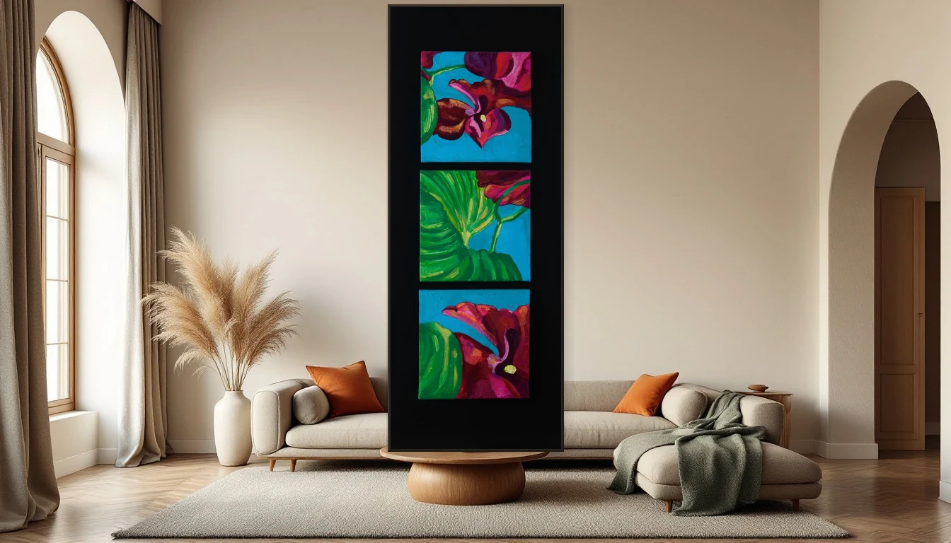
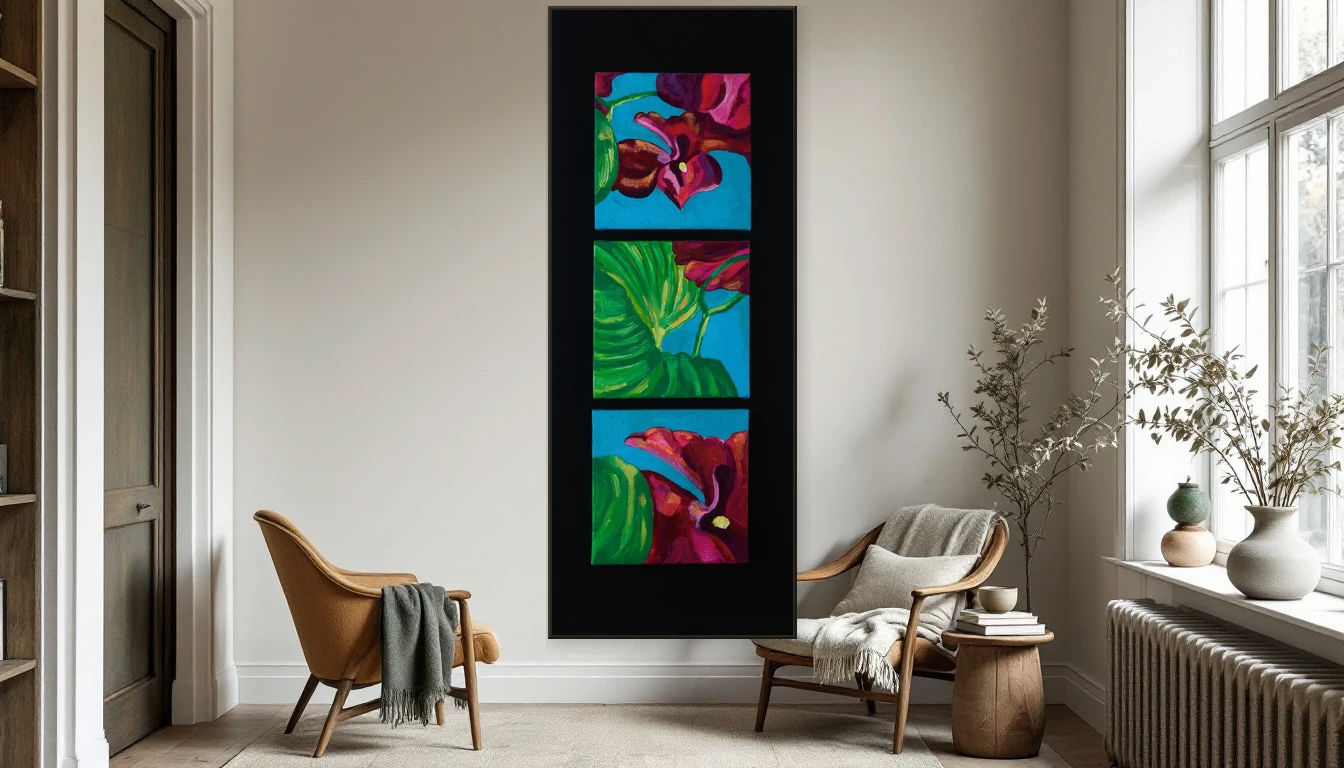
Organic forms — Seek flowing lines, curves and asymmetric compositions. Nature does not work in right angles. A triptych like Orchids translates the movement of petals into abstract colour without depicting them literally.
Earthy palettes — Think ochres, moss green, terracotta, soft blue and warm cream. These tones connect your interior to the world beyond the window, even when the sky is grey.
Texture and layering — Art with visible brushstrokes, impasto or mixed media adds a tactile dimension that photographs cannot capture. The difference between a print and an original is something you feel in your chest before you notice it with your eyes.
Scale — Biophilic art asks for space. One generous piece on a prominent wall has far more presence than a cluster of small frames. Let the work breathe, the way nature does.
Pairing art with natural materials
The strength of biophilic design lies in harmony. An abstract painting with organic forms becomes more powerful when the room around it responds. Pair it with linen curtains that soften the light, a wooden side table with visible grain, ceramic vessels in muted earth tones, dried grasses or eucalyptus branches, and woollen throws in neutral shades.
The key is not abundance but authenticity. Every material should feel real. Plastic and high-gloss finishes work against the effect.
Winter as an invitation
I know — November does not feel like the obvious time for change. But perhaps that is precisely what makes it the right time. As nature pulls inward, so can you. Into your own space, your own stillness. And that space deserves images that remind you of growth, of bloom, of the organic patterns that surround us everywhere — if only we look.
Curious which piece might suit your home? Browse the abstract collection or get in touch. Together we will find the work that brings your wall to life.
— Dinah