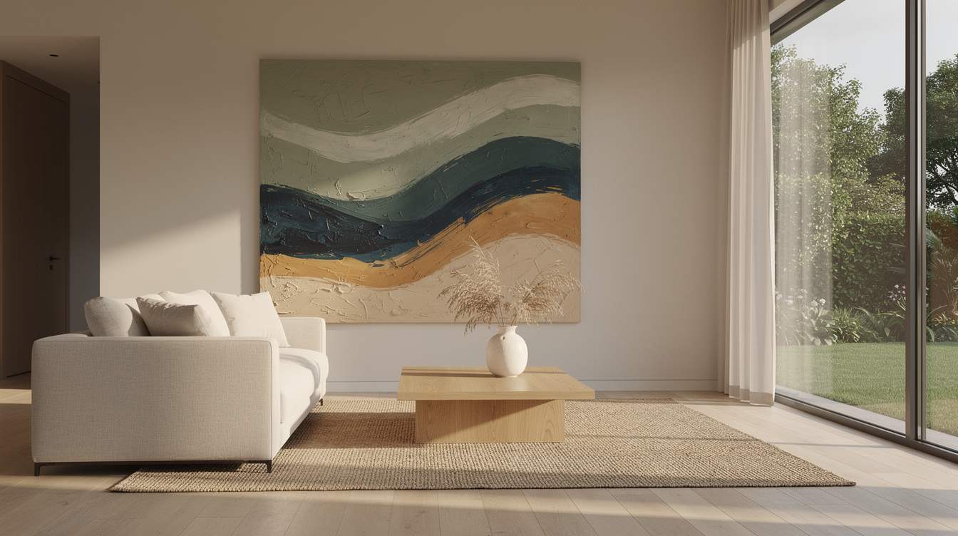
I was standing in my studio the other day, studying a piece I'd just finished — broad sweeps of muted sage, layers of ocean blue bleeding into one another, a streak of warm ochre cutting through like late afternoon light. A friend looked at it and said: 'It feels like being outside.' That's exactly what I was after.
Biophilic Design: Beyond the Potted Plant
You've probably noticed: the interior world in 2026 is captivated by biophilic design — designing from a love of nature. But where last year's approach was about cramming as many plants into a room as possible, this spring the movement has matured. It's no longer about quantity. It's about how a space feels.
Designers are calling it the shift from 'plants in pots' to 'nature as experience.' Daylight choreographed to enter a room intentionally. Organic curves in furniture. And — increasingly — art on the wall that captures nature's essence without depicting it literally.
That's precisely where abstract art becomes powerful.
Why Abstract Feels Greener Than Literal
It sounds counterintuitive: an abstract painting with sweeps of green and blue would bring you closer to nature than a photorealistic forest print? Yet research confirms it. Scientists have shown that organic forms and natural colour palettes in our surroundings produce psychological effects similar to actual nature exposure — your stress levels drop, creativity rises, and you feel more balanced.
Abstract art does this in a remarkable way. Where a photograph of a forest tells your brain 'this is a forest,' an abstract work using those same greens and flowing forms lets your brain make the connection itself. You fill in the space with your own associations — a memory of the sea, a walk through the dunes, light filtering through leaves. That makes it more personal, and therefore more potent.
Nature's Colour Palette in 2026
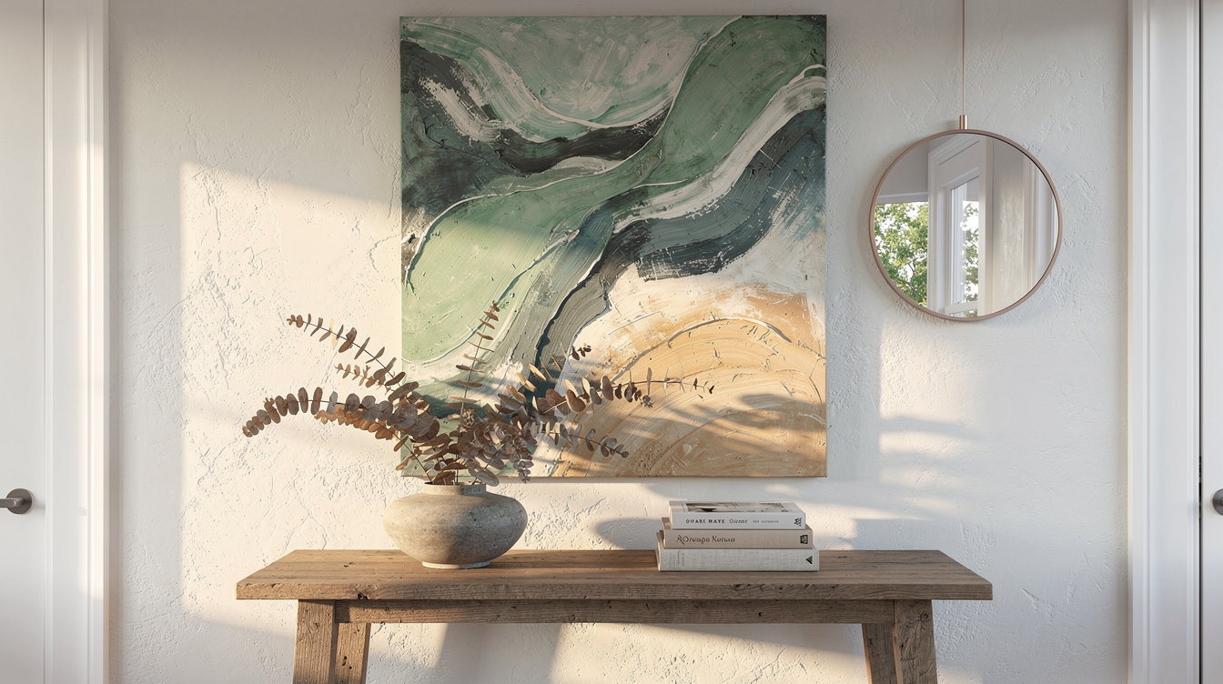
This spring's colour trends confirm the movement. Across the design world, the same shift is visible: away from cool greys, toward warm, organic tones. Muted sage, deep ocean hues, soft clay and sand — colours you don't pick from a paint chart but recognise from the landscape around you.
In my own work this season, I've been experimenting with what I call 'dune palettes' — that combination of soft sand, sea green, and stormy blue you find along the Dutch coastline. They're colours that bring calm yet carry depth. Exactly what an interior needs as a counterweight to the digital overstimulation of everyday life.
How to Bring Nature Home Through Art
My advice if you want your home to feel greener without starting a botanical garden:
Choose one large work with organic forms. No sharp geometry — look for flowing lines and soft transitions, the way nature moves. One generous canvas above the sofa or in the hallway does more than twenty small prints.
Let light do its work. Hang your artwork where natural light falls on it. The colours will shift throughout the day, just as they do outdoors. That makes the piece feel alive.
Pair it with natural materials. An abstract painting in earth tones next to a timber sideboard, a linen sofa, a stone vase — that combination amplifies the biophilic effect enormously.
Your Piece of Nature
I believe art is the shortest path to bringing nature into your home. Not as decoration, but as feeling. A well-chosen abstract work with organic forms and natural tones changes a room's energy in a way you sense the moment you walk in.
Curious which piece could become the green oasis in your interior? Browse my collection or get in touch — I'd love to think along with you.