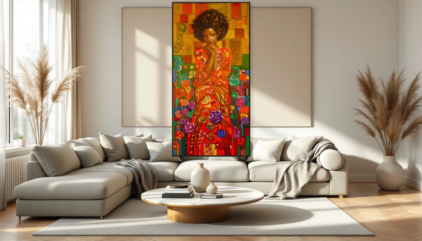
The other day I stood in my studio looking at a painting I’d just finished. I wasn’t analysing composition or checking the colour balance. I was just... feeling it. That gut response — the one that hits before your brain catches up — is exactly what the art world’s biggest shift is about.
What Is Mood-First Art?
For years, the default way to choose art for your home was to match it. Match the sofa, match the curtains, match the accent wall. But something has changed. Mood-first art is the growing movement of selecting artwork based on the atmosphere it creates rather than how it coordinates with your furniture.
International platforms like Artspace Warehouse have identified "the rise of mood-first art" — work defined by neutral palettes, textural depth, and an almost meditative quality. It’s not about standing out. It’s about drawing you in.
Why Now?
We live in a world of relentless stimuli. Screens, notifications, endless options. More and more people are turning their homes into sanctuaries — spaces that don’t demand more from you, but give something back. Art plays a pivotal role in that.
The comeback of abstract expressionism in 2026 underscores this shift. Hand-painted originals with visible brushstrokes, layered surfaces, and an unmistakable human touch are being chosen over flawless digital prints. People want to feel the maker’s hand. That’s not nostalgia — it’s a hunger for authenticity.
How to Choose by Feeling
In my own creative process, I see it every day: the most powerful works aren’t the most carefully planned — they’re the most honest. The same principle applies when choosing art for your space. Here’s how I approach it:
Notice your first response. Walk into a gallery or scroll through a collection and pay attention to which piece holds your gaze. Not the one you think is clever or impressive — the one you can’t walk away from. That distinction matters.
Think in mood, not in colour. Do you want your living room to feel calm? Energised? Full of wonder? Choose a work that carries that atmosphere. Sometimes that’s a warm earth tone, sometimes an unexpected blue.
Trust the pull. The best art purchases I’ve witnessed — from clients and my own collection — were the moments someone said: "I don’t know why, but it has to be this one." That ‘not knowing why’ is the reason.
Mood-First in Practice
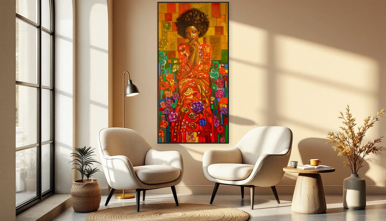
The beauty of this approach is that it frees you from the fear of getting it "wrong." There is no wrong when you choose by feeling. An abstract work in soft, warm tones can sit beautifully next to a chair in a completely different palette — precisely because it doesn’t match, yet it belongs.
Flexa’s Colour of the Year 2027, Soulful Sage, fits this narrative perfectly. It’s a shade that radiates calm and connection with nature — exactly the kind of feeling that mood-first art reaches for. Not loud, but present. Not flashy, but deeply felt.
Art as Conversation
Ultimately, this is about something bigger than interiors. Mood-first art invites you to be honest about what you feel and what you need. My abstract paintings don’t tell stories in words — they open a conversation you have with yourself. And that conversation shifts with every mood, every season, every stage of life.
Curious which piece speaks to you? Browse the collection and let yourself be surprised. Or book a workshop and discover what it feels like to make that first mark on canvas yourself.