Last week a woman walked into my studio and ran her fingers across a canvas before she had even properly looked at it. She wasn't trying to touch it — she simply couldn't help herself. The paint was thick, the edges were rough, and somewhere halfway through I had let a layer crack so the colour underneath bled through. 'This is alive,' she said. And I thought: yes. That is exactly why I make it this way.
The end of the flat wall
Something is shifting in the way we relate to art at home. For years, smooth digital prints dominated our interiors — sharp, flat, interchangeable. Beautiful on a screen, but once you stood in front of one in real life, it felt like wallpaper with a price tag. In 2026, that is changing. From Dezeen to Homes & Gardens, the major design publications are reporting a hunger for tactility. For work you experience not just with your eyes, but almost with your hands.
The keyword is texture. Thick paint layers, visible brushstrokes, surfaces that catch and release light as you move past them. Impasto techniques once dismissed as old-fashioned are now exactly what collectors seek. Not because they are trendy, but because after years of living in a digital world, we want to feel something real again.
Wabi-sabi: the courage of imperfection
The Japanese have a word for it: wabi-sabi. The beauty of transience, of irregularity, of things that carry the marks of their making. A crack in a ceramic bowl. An uneven line in a textile. A paint layer that splits because the artist let it split.
Design writers are calling wabi-sabi one of the most influential movements in interiors right now, and I see it confirmed with every visitor who walks into my studio. They no longer want perfection. They want character. They want a wall that tells them someone stood there with paint on her hands and a feeling in her gut.
What texture does to a room
A flat print reflects light in one way — constant, predictable. A textured painting does something entirely different. It plays with light. In the morning, when the sun enters low, shadows appear in the paint layers that vanish by two in the afternoon. The work shifts with the day, with the season, with how you stand in front of it.
This is not a side effect — it is the whole point. Neuroscience research confirms that our brains respond more strongly to tactile visual stimuli than to flat images. A surface with depth activates the same brain regions as actual physical touch. You feel it, even when you are not touching it. That is why your hand reaches toward a thickly painted canvas before your mind has given permission.
How I build texture
In my studio I work in layers — sometimes five, sometimes ten. The first layer is often thin, fluid, almost like watercolour. Then I build up: thicker paint, natural pigments, sometimes a mix of acrylic and medium that I press onto the canvas with a palette knife. Between layers I let things dry, I scratch through, I deliberately let cracks form.
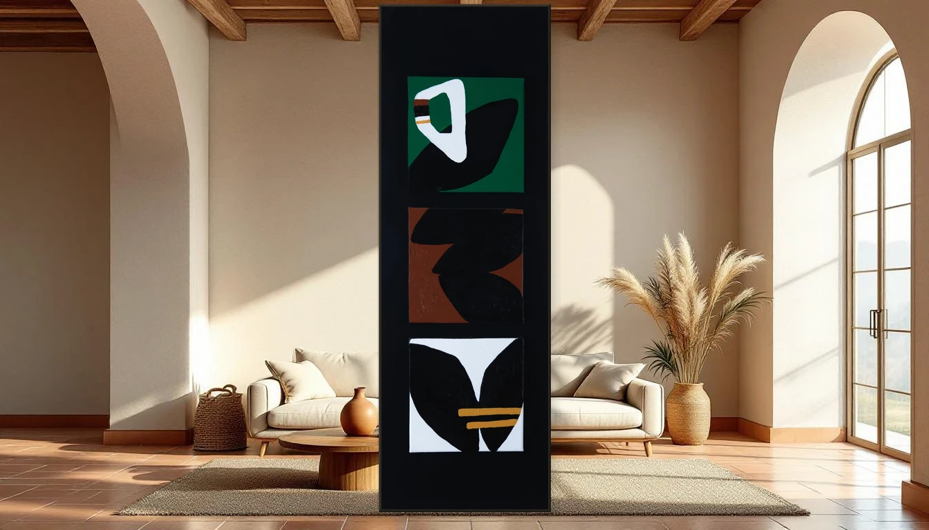
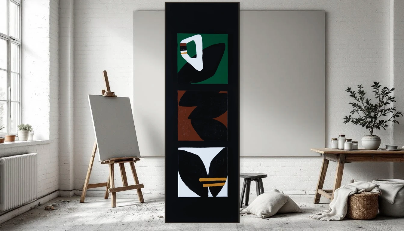
My Ethnic Brown triptych shows this process most clearly. The tribal forms are not designed on a computer — they were set by hand, in a single session, with every irregularity that comes with that. One line is slightly thicker than the next. One wing shape is not identical to its counterpart. And that is precisely why it works. The way a handwritten letter says more than an email ever could.
Choosing texture for your home
If you are considering bringing texture into your interior, start with the room that would benefit most from warmth. Often that is the living room or the hallway — spaces you pass through daily, where a textured piece becomes a quiet anchor.
Look for work with materials you can feel — even when you don't touch them. Visible brushstrokes, relief, colour layers that show through one another. And dare to choose something imperfect. The crack in the paint, the unexpected colour accent, the edge that doesn't run quite straight — those are the things that keep a piece alive. Year after year.
Imperfection as luxury
We have grown so accustomed to the smooth, the digital, the optimised, that we have forgotten how liberating it is to have something raw in our homes. A work that didn't come from a printer but from someone's hands. Not perfect, but exactly right.
Browse my originals collection and feel the difference. Or visit the studio — because texture is something you only truly understand when you stand in front of it.