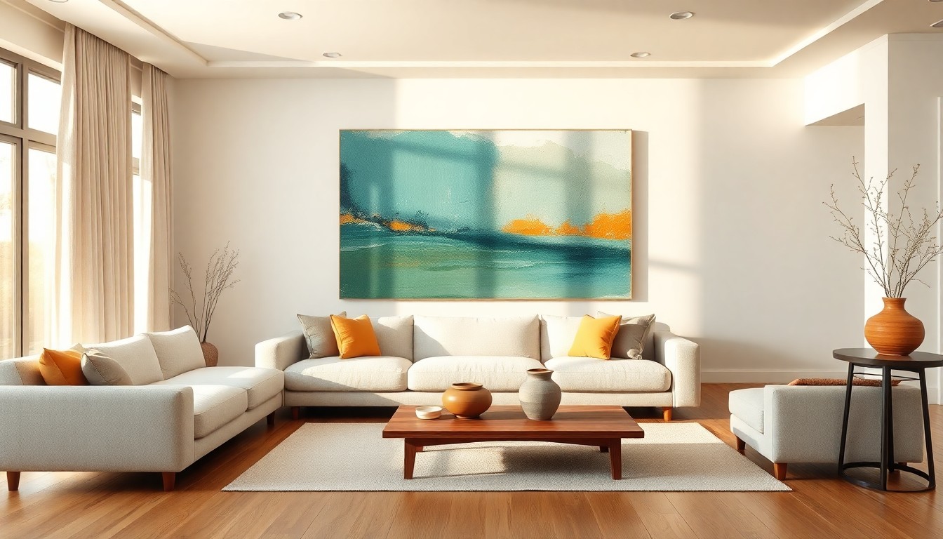
A friend visited my studio last week. She stood in front of a large canvas — deep teal layers cut through with streaks of warm ochre — and after a moment she said, quietly: 'This makes me feel calmer.' She couldn't explain why. But I could.
Your brain reads colour as emotion
What she experienced wasn't suggestion — it was neuroscience. Our brains don't just see colour; they feel it. The field of neuroaesthetics studies exactly this: how our nervous system responds to colour, form, and beauty. The findings are remarkable.
Blue and blue-green tones activate the parasympathetic nervous system — the branch that slows your heart rate, deepens your breathing, and tells your body it's safe. Warm tones like ochre, terracotta, and soft coral do the opposite: they heighten alertness, bring warmth, and create a sense of belonging. Green sits precisely in the middle — it balances, calms, and revitalises simultaneously.
This isn't abstract philosophy. Studies show that hospital patients in rooms with art and considered colour palettes recover faster and need less pain medication. If colour can do that in a hospital, imagine what it does in your living room.
Cloud Dancer meets Transformative Teal: the colour story of 2026
This year's colour narrative is unusually clear. For the first time in its history, Pantone chose a white as Colour of the Year: Cloud Dancer. Not a clinical white, but a soft, warm off-white with natural undertones — a colour that creates breathing space without feeling empty.
Meanwhile, WGSN and Coloro named Transformative Teal as their defining colour — a deep, shifting blue-green that radiates both calm and transformation. Together, these choices tell the same story: we crave spaces that soothe without boring us. That breathe but also hold depth.
Across interiors globally, this translates into a rise of soft greens — sage, moss, eucalyptus — paired with refined earth tones and those new, nuanced neutrals. Colours that don't shout at you. Colours that whisper.
Abstract art as an emotional compass
This is where my work becomes personal. When I choose colours for a painting, I don't match them to a sofa or a wall. I choose them by feeling — and that feeling has a neurological foundation.
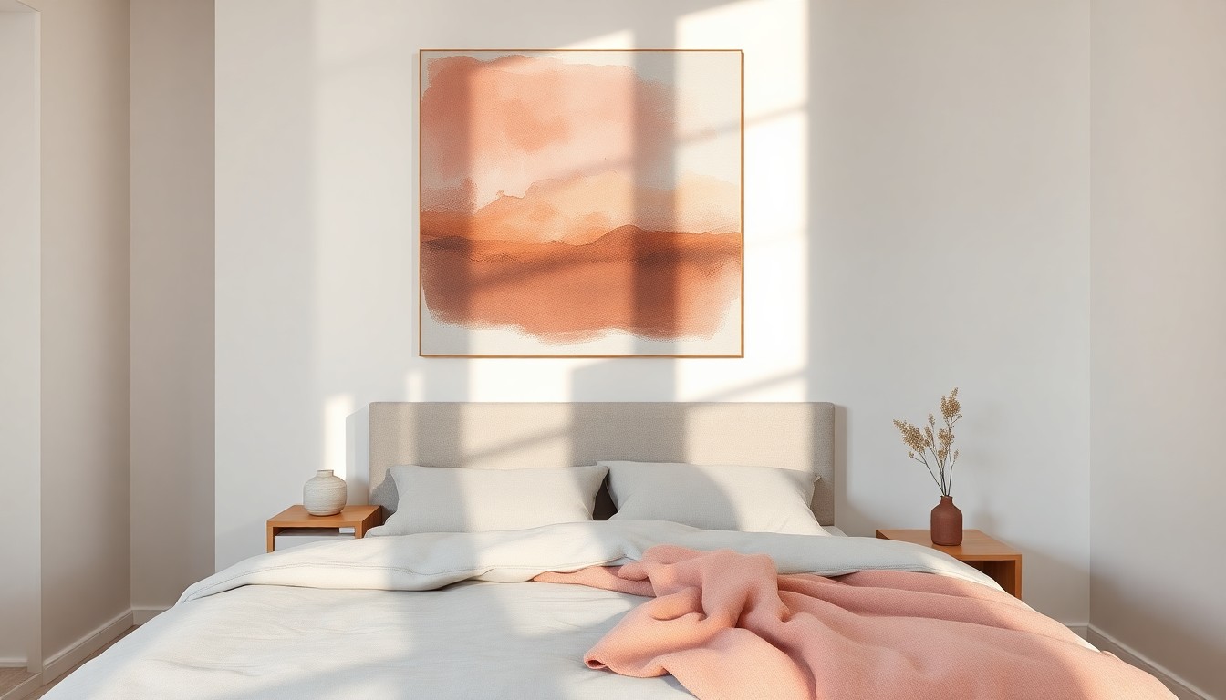
A canvas layered in deep teal with undertones of grey and silver brings stillness to a busy living room. A work in warm ochre, burnt sienna, and dusty rose wraps a bedroom in comfort. An interplay of forest greens with gold makes a home office feel alive without becoming restless.
The difference between art and a painted wall is that art is layered. An abstract painting holds dozens of tones working in concert — it's not a flat colour but a colour landscape. Your eye travels through the work, picking up different nuances each time. That makes the emotional effect richer and more subtle than any wall paint could ever achieve.
How to choose colour that fits you
My advice is surprisingly simple: close your eyes and picture your ideal moment at home. Do you feel calm? Look for blue-greens and soft greys. Do you feel warmth and cosiness? Earth tones and warm pinks are your direction. Do you feel energy and inspiration? Go for greens with gold or ochre accents.
Then browse my collection and notice what your body does. I mean this seriously — your breathing quickens or slows, your shoulders drop or tense. Your body knows before your mind catches up.
And remember: you don't need to match everything. Cloud Dancer teaches us that sometimes the most powerful colour is the quietest one — a warm white that lets every other colour speak.
Colour isn't decoration — it's self-care
The World Health Organization now recognises creative engagement as a meaningful contributor to mental health. That extends beyond making art yourself — it includes the colours and art you choose to live with every day. Every colour you bring into your home is a choice about how you want to feel.
That's what I find most beautiful about my work. I don't make decoration — I make pieces that interact with your nervous system, your mood, your day. And it all starts with colour.
Start by feeling
So next time you look at a piece of art, don't ask whether it matches the couch. Ask yourself: what does this colour do to me? Do I feel calmer? More energised? More at home?
That's your answer.
Curious which colours suit your space and your mood? Explore the collection or get in touch for personal colour advice.