
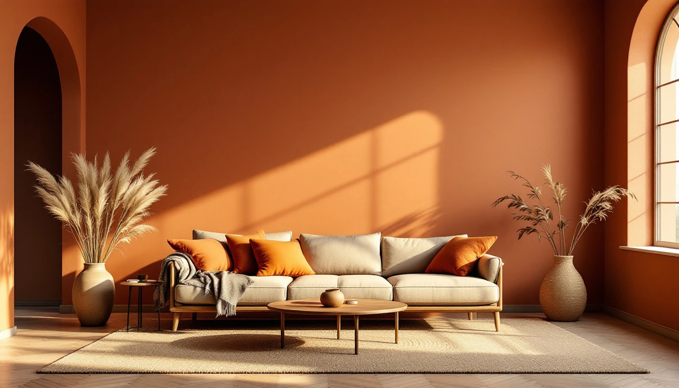
Yesterday I stood in my studio looking at a canvas I had just finished — warm ochre, deep terracotta, a whisper of moss green. It felt like coming home. That is no coincidence: earth colours tap into something primal. And in 2026, the design world has caught up with that feeling. The era of cool greys is over. Warm is the new white.
The great palette shift
For over a decade, interiors leaned into crisp whites and cool greys. Clean and polished, yes — but often emotionally distant. Now the pendulum is swinging back hard. Designers across Europe and beyond are gravitating toward clay, terracotta, ochre, olive green, and warm taupe. Not as a passing fad, but because neuroscience confirms what our instincts already knew: earthy hues signal safety and calm to the human nervous system.
The science of warm colour
Research in biophilic design shows that earth tones lower cortisol and create a sense of grounding. When we surround ourselves with the colours of soil, stone, and dried grass, our bodies respond as if we are outdoors. It is wellness through palette — no candles or meditation apps required.
In my own practice, paintings built from warm browns, rusty reds, and gilded accents consistently draw the strongest emotional reactions. People reach out to touch them. That tactile pull is exactly what a room needs: art that draws you in rather than holding you at arm's length.
How to layer earth tones at home
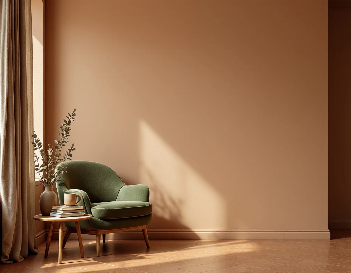
The beauty of a warm palette is how forgiving it is. Unlike high-contrast combinations, earthy colours flow into one another naturally. A terracotta accent wall behind an olive linen sofa. An ochre throw pillow beside an abstract painting in layered browns. Raw wood, ceramic vessels, linen curtains, and leather — these materials amplify the warmth without effort.
My advice: start with the art. Choose a painting with a warm palette as your anchor point and let the rest of the room respond. You do not need a perfect colour match — the subtle variations within the earthy spectrum are what create depth and visual interest.
Drama within warmth
One common misconception: earth tones do not mean dull. The interplay between light and dark within the same warm spectrum creates quiet drama. Deep espresso brown beside soft sand. Rusty accents against warm cream. An abstract triptych in shifting brown tones against a pale wall — that is calm and powerful at once.
Art as atmosphere
The most memorable interiors I have seen this year share one quality: they treat art not as decoration, but as the room's emotional thermostat. A large-scale abstract work in warm tones becomes the heart of the space, setting the temperature for everything around it.
The Dutch interpretation
In the Netherlands, we are putting our own spin on this trend. We combine the warm palette with our love for clean lines and functional design. The result: interiors that feel cosy and contemporary at the same time. Not maximalist boho — considered warmth with room to breathe.
Invest in feeling
Why does this matter? Because your home is more than a collection of furniture. It is where you recharge, where you land at the end of the day. And colour is the most powerful — and most underestimated — tool for shaping that experience.
Your earthy beginning
Curious how a warm, grounded painting could transform your space? Explore the DNH Artful Living collection — from abstract triptychs in rich brown tones to organic textured works. Or book a complimentary consultation and we will find the perfect piece for your room together.