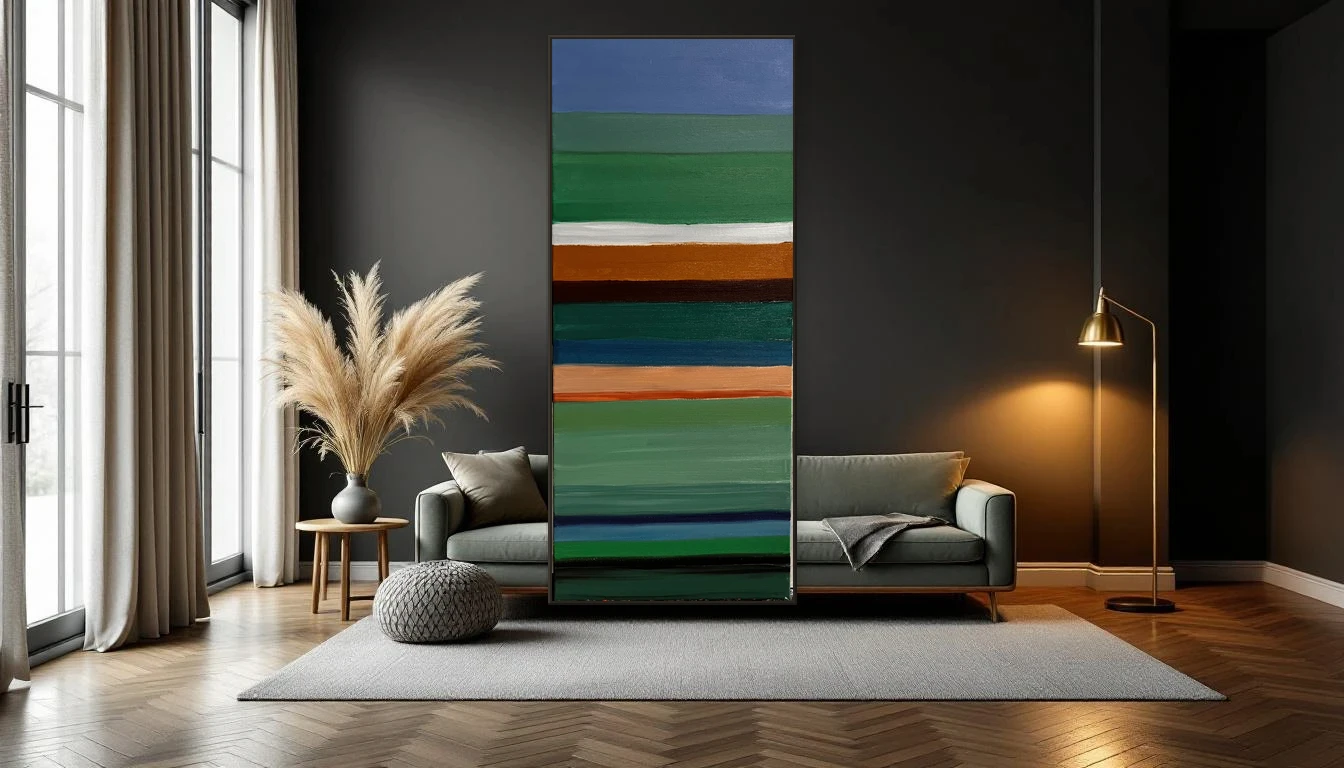
The other day I leaned a freshly finished canvas against the charcoal grey wall of my studio. The colours — the same piece that had looked almost shy against white — suddenly leapt forward. It was as if the painting had woken up.
That moment confirmed what I had long suspected: a dark wall is not a cave. It is a stage.
The Return of Moody Interiors
For years, white was the safe choice. Understandable — it reflects light and makes small rooms feel larger. But in 2026, the tide has turned. Interior designers across Europe and beyond are embracing deep tones: charcoal, midnight blue, forest green, warm burgundy. The design world calls it the moody movement — a collective craving for intimacy, depth and character at home.
And honestly? I get it completely. A dark wall gives a room gravity. It feels like the space is drawing you in rather than pushing you away.
Why Art Works Better on Dark
The secret is contrast. On a white wall, lighter tones in a painting compete with the wall itself — they almost vanish. But hang that same work against a deep background, and every colour gets room to breathe and shine.
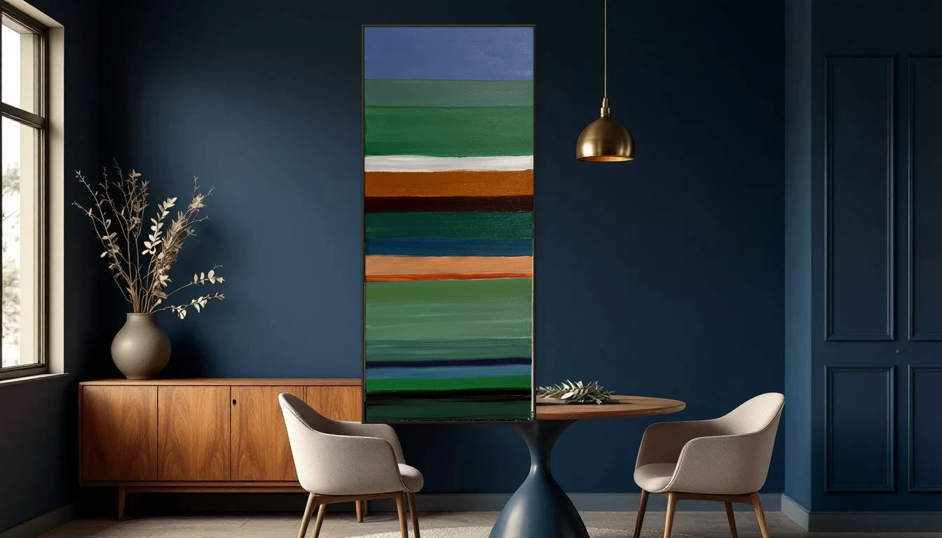
Picture a painting with warm ochre, emerald green and soft blush pink. On white, it reads as subtle. On deep grey or navy, those colours become magnetic. It is the same principle as a jewel on dark velvet — the setting does the work.
This applies to more than colourful abstract art. Monochrome pieces with thick texture gain enormously from a dark backdrop too. Shadow play across impasto layers becomes visible in a way that simply does not happen on white.
Choosing the Right Dark for Your Wall
Not every dark shade works the same way. Here are a few guidelines I follow in my own practice:
Charcoal and slate grey are the most versatile. They work with almost any art style and draw very little attention to themselves — all focus goes to the work.
Deep midnight blue adds a touch of drama and pairs beautifully with warm metallic accents and golden tones in art.
Forest green brings organic warmth. Ideal if your art features nature-inspired hues, or if your interior already leans into wood and natural materials.
Burgundy and aubergine are bolder choices, but in the right space — a dining room, a reading nook — they create something truly unforgettable.
Getting Started: Practical Steps
You do not need to transform your entire living room overnight. Start with one accent wall — the wall where your favourite piece of art lives. Paint it in a deep tone and keep the rest neutral. The effect is immediate.
A few tips I love to share:
Invest in good lighting. A picture light or directed spot makes the difference between beautifully dark and just dark. LED lighting with a warm colour temperature flatters both the wall and the artwork.
Pair dark with warm materials. Brass lamps, linen cushions, a wooden console — they bring life to a dark palette. In 2026, this combination appears everywhere: the warmth of craft materials against the depth of a moody wall.
Think big. A large painting on a dark wall is not overwhelming — it is exactly right. It anchors the room and creates a focal point that radiates calm energy.
Contrast as a Way of Seeing
What I love most about this trend is that it is really about courage. About daring to choose. Not taking the safest option but the most honest one. Just like in my painting practice — the most beautiful moments happen when I dare to contrast. An unexpected colour next to another. A soft stroke beside a bold mark.
Your interior tells a story. And a dark wall with a radiant artwork above it says: someone lives here who knows what beauty is. Not cautious beauty, but real beauty.
Curious how a DNH piece could bring your dark wall to life? Browse the collection or get in touch — I would love to think along with you.