For years we played it safe. White walls, grey sofas, beige cushions — pretty, sure, but let's be honest: a little predictable. This year, everything has shifted. The trend sweeping through design magazines and mood boards alike goes by a deliciously unapologetic name: colour-maxxing. And I'm completely here for it.
What colour-maxxing actually means
Colour-maxxing is the art of committing to colour. Not a timid accent wall, but a full embrace. Picture a living room drenched in deep burgundy. A bedroom wrapped in warm olive green. A dining room in teal that somehow feels both calming and daring. The entire space becomes a colour envelope — walls, trims, sometimes even the ceiling in one continuous tone.
It's a reaction to years of safe, neutral interiors. After all that white and grey, we're craving warmth, personality and courage. I recognise that impulse from my own studio practice: the most exciting work happens when you dare to go further than what feels comfortable.
Why abstract art thrives on bold walls
You might assume a colourful wall competes with artwork. The opposite is true. Abstract art — with its free forms, unexpected colour dialogues and emotional depth — actually comes alive against a daring backdrop.
An earthy, warm abstraction in ochre and sienna against a burgundy wall creates a richness you'd never achieve on white. A piece with cool blue undertones against olive green produces a tension that holds your gaze. It's a conversation between art and space — not a competition.
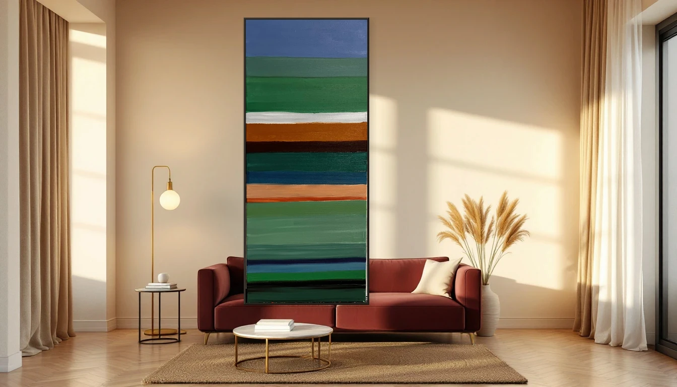
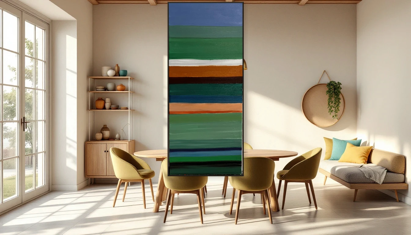
This is exactly what leading interior designers are advising in 2026: choose one large statement artwork instead of a gallery wall of small prints. One powerful piece that anchors the room.
The colour pairings of the moment
So what works right now? Here are the combinations I find most compelling:
Burgundy + warm metallics — A deep red wall with brass accents and an abstract piece in gold and earth tones. Luxurious without being loud.
Olive green + cream + natural wood — Bringing the outdoors in. Olive walls, light wooden furniture and an abstract landscape in soft greens and whites. Serene yet distinctive.
Teal + butter yellow — The surprise pairing of the year. Teal feels fresher than dark green, and butter yellow brings warmth without shouting. An abstract work that echoes both colours ties the room together beautifully.
Chocolate + periwinkle — For the truly adventurous. Deep brown as a base with soft lavender-blue as contrast. Unexpected, refined, and exactly the mood where abstract art with gentle colour transitions excels.
How to start — without turning your whole home upside down
I understand the hesitation: a fully colour-drenched room feels like a big commitment. But colour-maxxing doesn't have to go from zero to maximum overnight. Start with a room you were already planning to refresh — perhaps the hallway, a reading nook or the bedroom. Choose a colour that energises you or brings calm. Apply it to the walls, then look at your art.
You'll often find that a painting which seemed merely 'nice' on a white wall suddenly lives against colour. Hues resonate differently, shadows deepen, the entire piece gains a new dimension.
Your wall as a canvas
What I love most about this trend is how it reframes the wall itself as a canvas. The wall colour is the first layer of your composition. The artwork is the second. Together, they tell a story.
And that's ultimately what turns a house into a home — not catalogue-perfect styling, but layers of colour, texture and meaning that say something about who you are.
Curious which artwork suits your new wall colour? Browse the collection or get in touch — I'd love to think along with you.