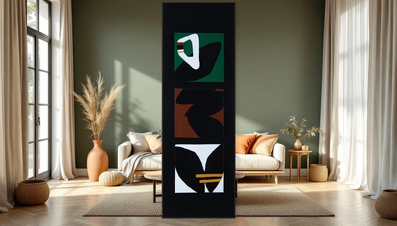
The first colour-of-the-year announcements for 2027 have landed, and they share a quietly powerful message: we are craving nature. After years of stark minimalism and moody dark palettes, the world is turning back to the earth. To mossy greens, dusted pinks, and tones that feel like a walk through a damp forest at golden hour.
Rewild: Sherwin-Williams Sets the Tone
Sherwin-Williams has named their 2027 trend forecast Rewild — an invitation to design by instinct rather than formula. Their colour of the year, Celery, is a gentle, luminous green that brings instant calm. It speaks of fresh leaves and early morning light, and it pairs beautifully with natural materials and textured art.
Rose Earth: Pink, Grown Up
Graham & Brown chose Rose Earth, a dusty pink with real depth. There is nothing sugary about it — think sun-baked clay, ancient terracotta, the warmth of a Mediterranean wall at dusk. In my studio, I have been drawn to these tones for months. They have a quiet confidence that makes everything around them feel intentional.
Soulful Sage: The Green That Stays
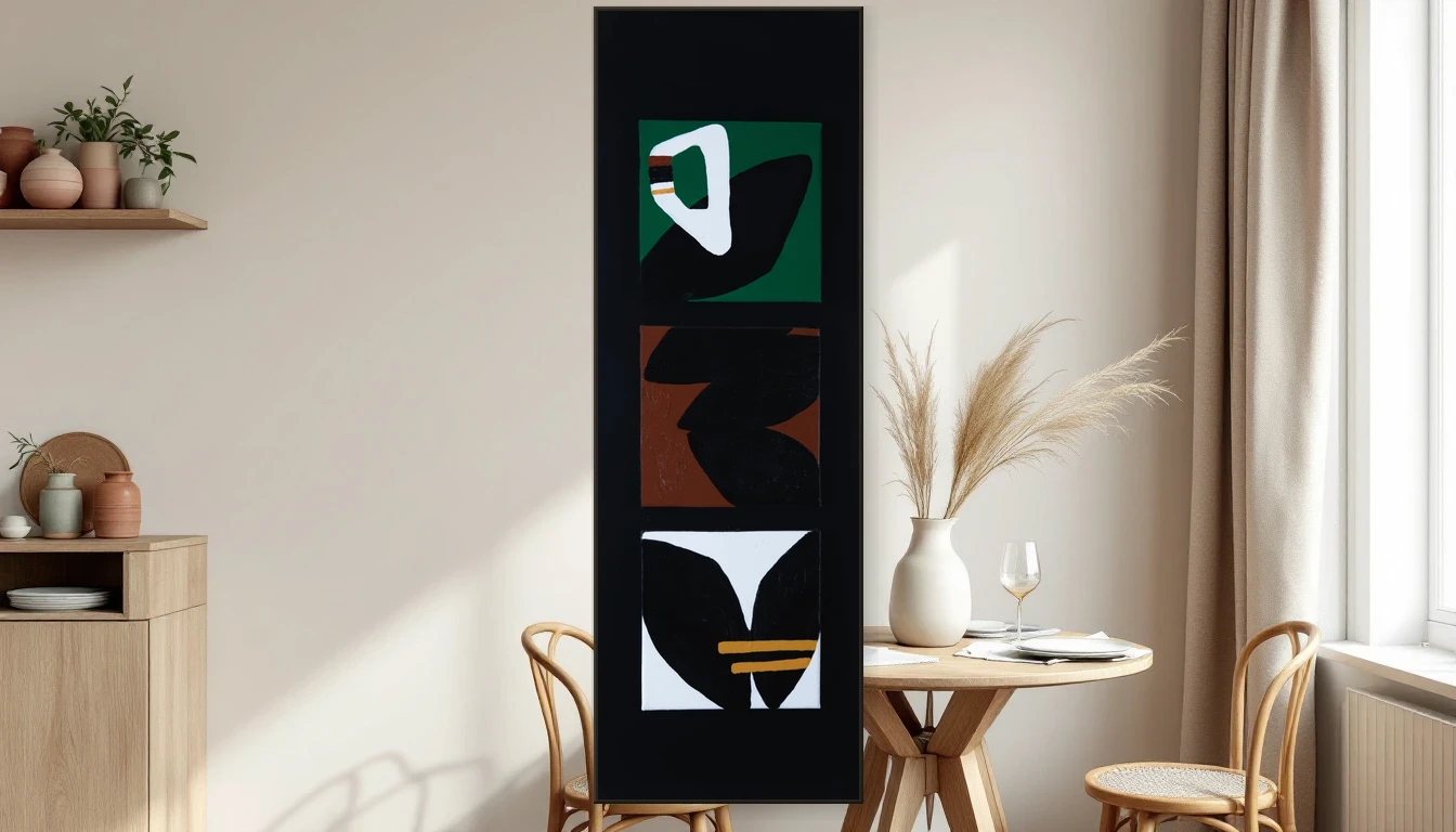
Dulux has chosen Soulful Sage, a muted sage green with remarkable staying power. Unlike fleeting accent colours, sage works as a true foundation. It flatters abstract art without competing — a generous backdrop that lets the painting breathe.
The Common Thread: A Return to Earth
Across every major forecast, the same narrative emerges. Less digital, more sensory. Less pristine, more real. The colours of 2027 ask for materials you want to touch — linen, raw wood, handmade ceramics — and for art that amplifies that tactile honesty.
What This Means for Art in Your Home
When your walls shift toward earthy tones, the relationship with the art on them transforms. Abstract work with warm undertones — ochre, raw sienna, soft verdigris — no longer contrasts with the space. It converses with it, creating rooms that feel unified rather than decorated.
Texture Becomes the New Detail
The 2027 palette is not just about colour — it is about surface and touch. A painting with visible brushwork, layered pigment, or sculptural impasto fits naturally into interiors built from honest materials. The handmade quality of the art echoes the handmade quality of the space.
My Advice: Start with Feeling
Colour trends are a compass, not a rulebook. When a particular shade moves you, pause and ask why. Often there is a memory or a longing behind that pull. That is the colour your home deserves — not a shade a report told you to love.
Bring It to Your Walls
Curious how earthy tones and abstract art come together? Explore the collection at DNH Artful Living and discover which piece resonates with your sense of colour. Or reach out — I love helping people find the right work for their space.