
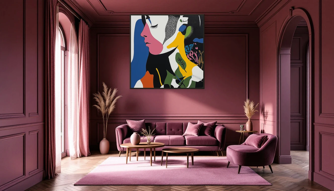
Picture walking into a room where every surface — walls, ceiling, trim, even the sofa — is steeped in the same deep hue. No visual noise, no competing accents, just colour wrapping around you like a cocoon. This is colour drenching, and it has become the defining interior trend of 2026.
In my studio, I see the shift first-hand: collectors who once played it safe with neutral palettes are now committing to full-spectrum immersion. And here is what fascinates me most — in a monochrome interior, art takes on an entirely different presence.
What colour drenching actually means
Colour drenching is the practice of coating every surface in a room within a single colour family. Walls, ceiling, skirting boards, doors — everything participates. The result? Hard edges dissolve, the space feels simultaneously larger and more intimate. Your brain no longer processes visual boundaries, creating a sense of calm that is surprisingly powerful.
The trend has roots in high-end European design but has now gone mainstream, with Zillow reporting a 150% increase in colour-drenched listings. From soft sage green to deep aubergine and warm caramel, the only rule is total commitment.
Why art behaves differently in a drenched room
In a conventional white-walled interior, a painting competes with furniture, textiles, and architectural details for your attention. In a colour-drenched space, art becomes the singular visual counterpoint. It steps forward. It breathes. It becomes the heartbeat of the room.
Finding the right pairing
There are two approaches to combining art with colour drenching, and both deliver striking results:
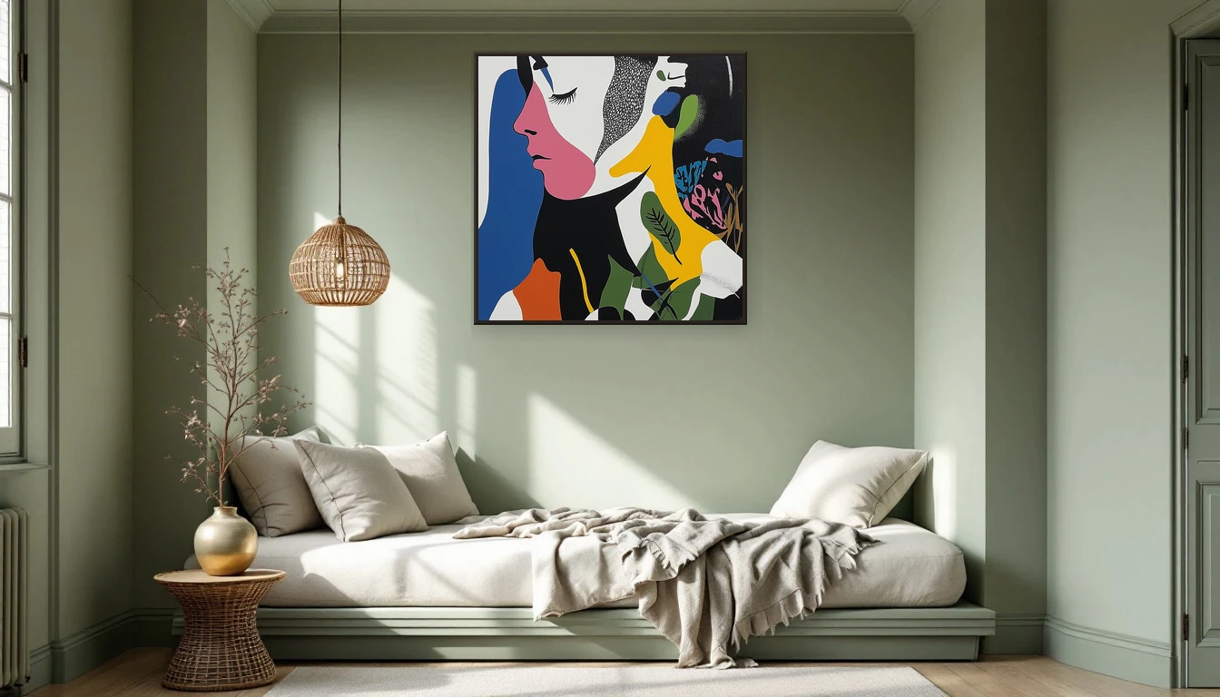
Harmonise with the hue — Choose a work within the same colour family as your walls. A blue-toned painting on a blue-drenched wall creates depth through texture and tonal variation without breaking the cocoon. The effect is subtle, refined, and deeply calming.
Contrast with intention — Select a work that deliberately breaks the monochrome spell. A warm, gold-inflected abstract on a cool blue wall pulls every eye in the room. This is art as focal point, as conversation starter, as visual anchor.
In my own practice, I find this interplay endlessly compelling: how does a painting respond to its surroundings? In a drenched interior, that dialogue becomes electric.
Practical guidance for your own walls
Start with the colour that gives you the most peace — or the most energy. Aubergine and bordeaux are leading this autumn, though warm tones like caramel and terracotta suit the season perfectly.
Choose one larger artwork rather than a gallery wall. In a monochrome room, you want your gaze to land somewhere definitive, not bounce around. An abstract work with visible texture works particularly well here: it offers visual variety without disrupting the colour harmony.
Consider the frame — or the absence of one. An unframed canvas feels most fluid in a drenched interior. The painting becomes part of the wall itself, not an object mounted upon it.
Start small, think bold
Colour drenching requires courage, but it rewards it generously. If you hesitate, start with a contained space: a bedroom, a study, a hallway. One colour, one beautiful artwork, and you will feel how the room shifts beneath your feet.
Your colour, your art
Curious which piece from the DNH collection would complement your colour scheme? Feel free to reach out or browse the collection online — I love helping find the perfect match.
The science behind the colour cocoon
Researchers have found that monochrome environments lower cortisol, the stress hormone. When your brain no longer needs to process visual borders — white trim clashing with painted walls, sharp transitions between surfaces — it literally frees up mental bandwidth. Add one carefully chosen artwork and you create a focal point that deepens the calm rather than disrupting it.
Which colours work this autumn?
Autumn 2026 belongs to warm, enveloping tones. Aubergine leads the pack — deep, ripe, and surprisingly versatile. But caramel brown, olive green, and soft powder pink also lend themselves beautifully to drenching. Pair them with materials that invite touch: bouclé, velvet, raw linen. The room becomes a place where your senses can truly settle.