
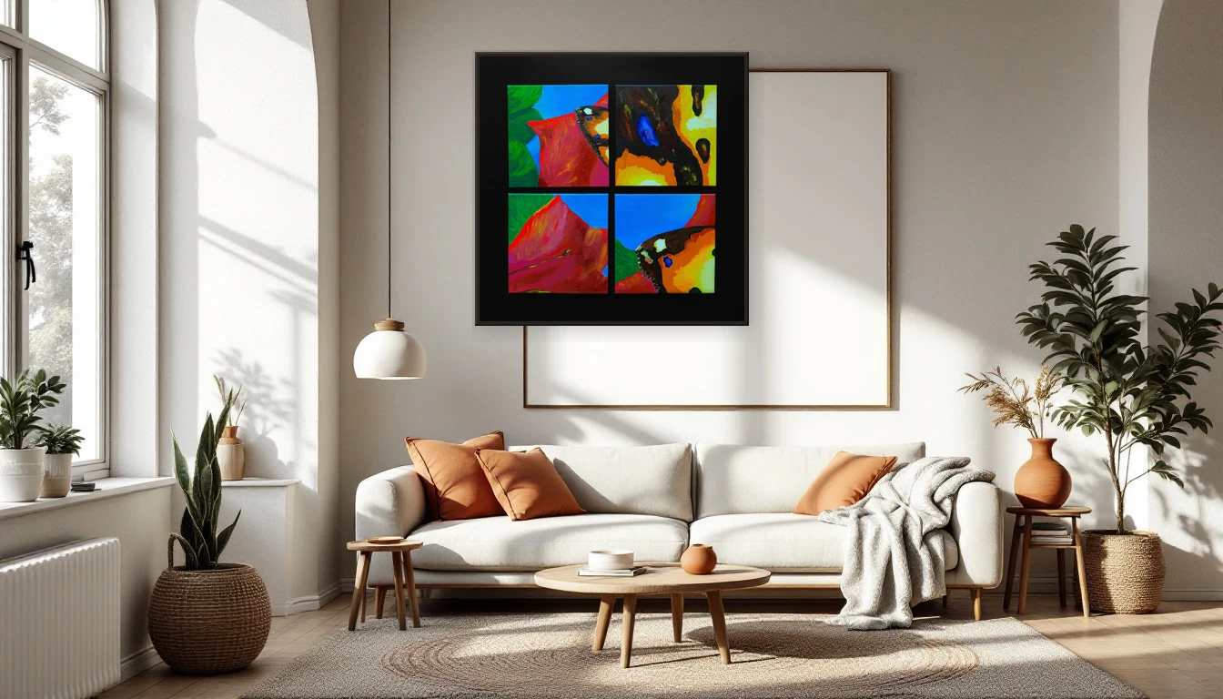
I was mixing a colour the other day — somewhere between old gold and honey, with a trace of raw clay. I looked at it and felt my shoulders drop. Not because it was beautiful, though it was. But because it did something. It made me still. And that is exactly what choosing art for your home should be about: not how it looks on the wall, but how it makes you feel inside it.
Colour is not decoration — it’s a physiological event
We think we pick colours because they’re attractive. But research in colour psychology tells a different story. Colour triggers neurological responses: changes in heart rate, blood pressure, even cortisol levels. Certain hues can lower your stress hormone within minutes. Others wake you up, sharpen focus, energise a room. The colour on your wall isn’t background — it’s a silent conversation partner that shapes your day from sunrise to last light.
The warm-cool spectrum: what fits your rhythm?
The broad principle is simple. Cool tones — blue, green, lavender — calm. They slow things down, invite reflection. Ideal for bedrooms, bathrooms, reading corners. Warm tones — ochre, terracotta, amber, burnt sienna — stimulate. They bring energy, warmth, connection. Perfect for living rooms, kitchens, dining spaces.
But the real magic lives in the in-between. A muted mustard that feels simultaneously warm and calm. A moss green that energises without pushing. In my own work, I’m always searching for that balance: palettes that hold multiple emotions at once, shifting with the light and your mood.
2026: the year of intentional colour
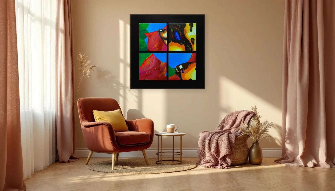
This year, the design world is choosing with purpose. Pantone’s Colour of the Year — Cloud Dancer, a soft off-white — reflects a collective need for calm and clarity. But that white is a foundation, not the full story. Around it, the autumn palette is emerging: deep burgundy, aubergine, chocolate brown, dusty rose. These are colours with weight, colours that anchor you in a restless world.
What I’m seeing from designers globally: people no longer choose colour on aesthetics alone. They choose on feeling. On wellbeing. They want to know what a colour does to them before it goes on their wall. And that is exactly where abstract art shines — it offers a daily colour experience you feel rather than merely see.
Start with your body, not your mood board
My advice when choosing art: put your phone away. Stand in front of a piece and notice what happens in your body. Do your shoulders soften? Does your breath deepen? Or do you feel a spark, an excitement? That’s your body telling you whether these colours fit you. No algorithm can do that.
Pay attention to the light in your room, too. The same ochre feels warm and inviting in south-facing light but can turn flat in northern light. A deep blue that’s dramatic by evening may feel distant by day. Colour is never static — it dances with the hours.
Why layered paint beats a print
A hand-painted work does something a print cannot: it builds colour in layers. Every brushstroke adds nuance — a glimpse of warm red beneath olive green, a whisper of white flickering through earth tones. That depth means you discover something new each day. It’s the difference between a photograph of the ocean and the ocean itself.
Find your colour
Curious which colours match the way you want to feel? Browse the collection and let yourself be surprised — or get in touch for personal colour guidance. The right art doesn’t need to be understood. It just needs to be felt.