
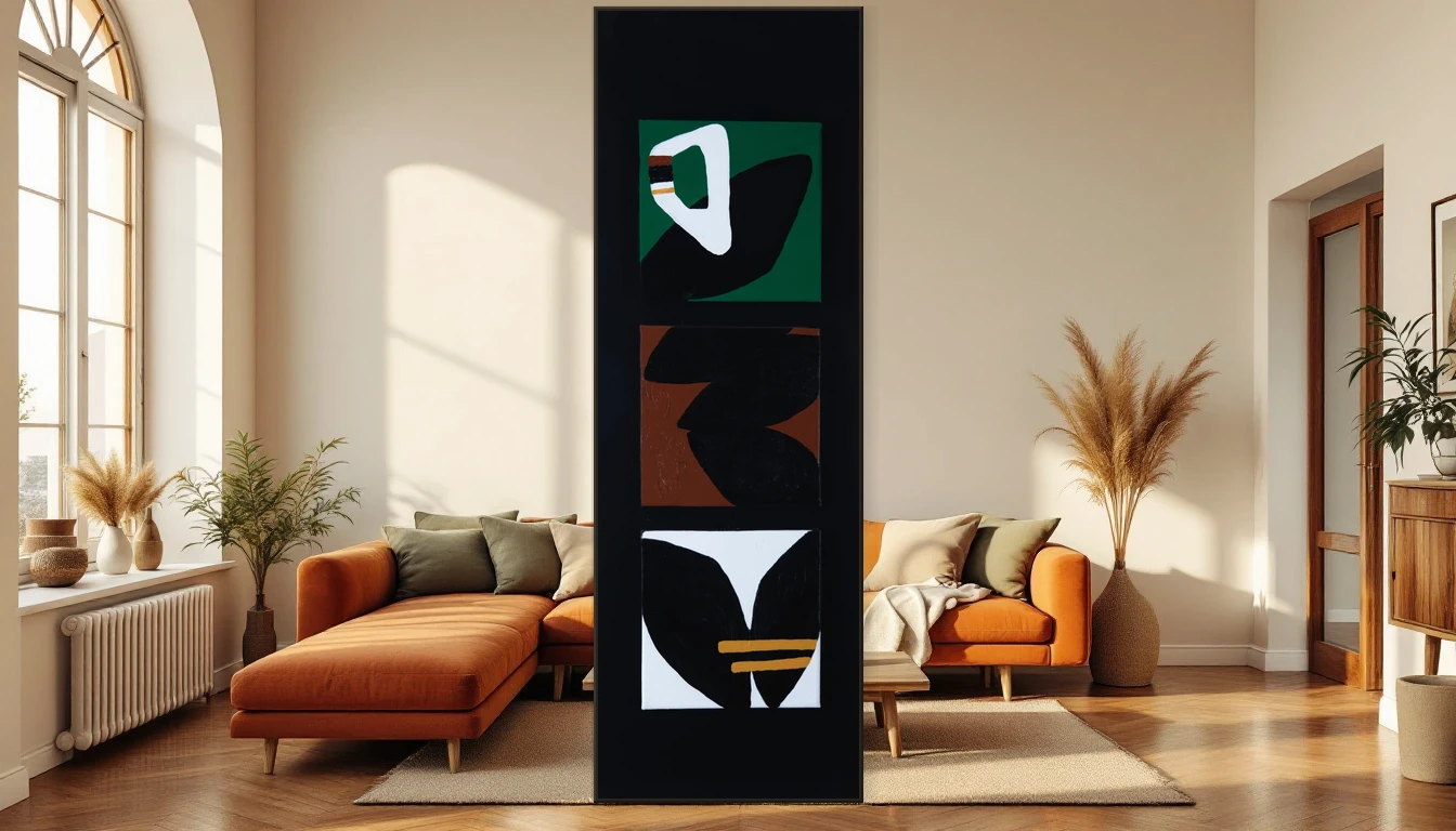
There is a moment in my studio when I drag a brush loaded with terracotta pigment across a fresh canvas and everything falls into place. The colour feels like coming home. That sense of being grounded is exactly what more and more people are seeking in their interiors this autumn.
The Earth Tone Takeover
The world's leading interior magazines are pointing in the same direction this season: away from cool greys and clinical whites, back towards warm, earthy palettes. Terracotta, olive green, sand, mustard and clay now rule the mood boards from Elle Decoration to Architectural Digest. These are colours that come from the ground — literally. And that is precisely why they feel so familiar.
This shift runs deeper than a passing trend. Interior designers talk about a craving for authenticity. After years of cool-toned minimalism, our homes are hungry for warmth and character. Earth tones deliver exactly that: timeless without being boring, striking without being loud.
Why Warm Works for Your Wellbeing
Colour affects you. I know this as an artist, but science confirms it too. Warm earth tones — the browns, rust reds and deep olives — have a measurably calming, grounding effect. They reduce visual stress and create a sense of shelter. In a world that grows more digital and faster by the day, your home serves as an anchor. And the colours you hang on your wall determine how steady that anchor holds.
Biophilic design — weaving natural elements into your living space — is the key concept here. It goes beyond a potted plant on the windowsill. It is about materials that feel genuine, light that shifts with the day, and art that carries the colours of the outdoors inside.
Art as a Bridge Between Outdoors and In
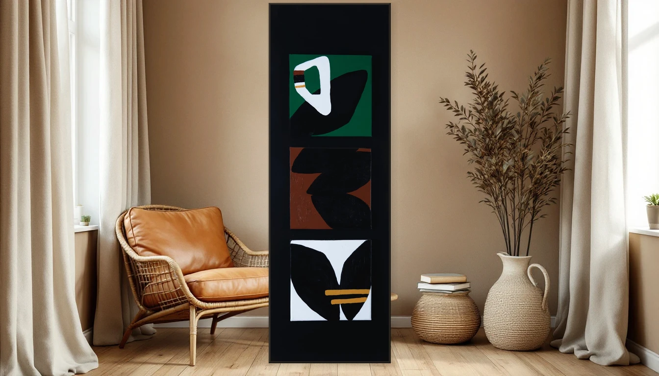
This is where it gets personal. When I work on my Abstracts collection, I deliberately reach for pigments you would find in nature: the brown of clay earth after rain, the rust orange of autumn leaves, the deep green of moss on bark. Abstract art in earth tones does something special in an interior: it brings the calm of nature indoors without needing to be a literal landscape.
A triptych in warm browns above a natural linen sofa. A single canvas in ochre and terracotta in your hallway. These are choices that do not just make a room prettier — they make it more felt. Your interior gains depth, warmth and soul, which is exactly what turns a house into a home.
How to Layer Earth Tones in Your Space
The power of earth tones lies in their versatility. They work with wood, with stone, with linen, with ceramics — really, with anything natural. My tip: choose one dominant warm accent — a large artwork, a painted wall — and build around it with materials in related hues. Think a jute rug, cushions in burnt orange, a vase in unglazed clay.
Do not be afraid to mix within the family. Terracotta next to olive, sand beside rust — these are combinations that occur in nature every day, so they always feel harmonious. The beauty of it is: you can hardly go wrong.
Your Earth-Toned Wall Starts Here
Ready to bring the warmth of earth tones into your own home? Explore the Abstracts collection — every piece is handmade in my studio and brings the colours of the earth to your wall. Or get in touch for a personal consultation about which work fits your space.