
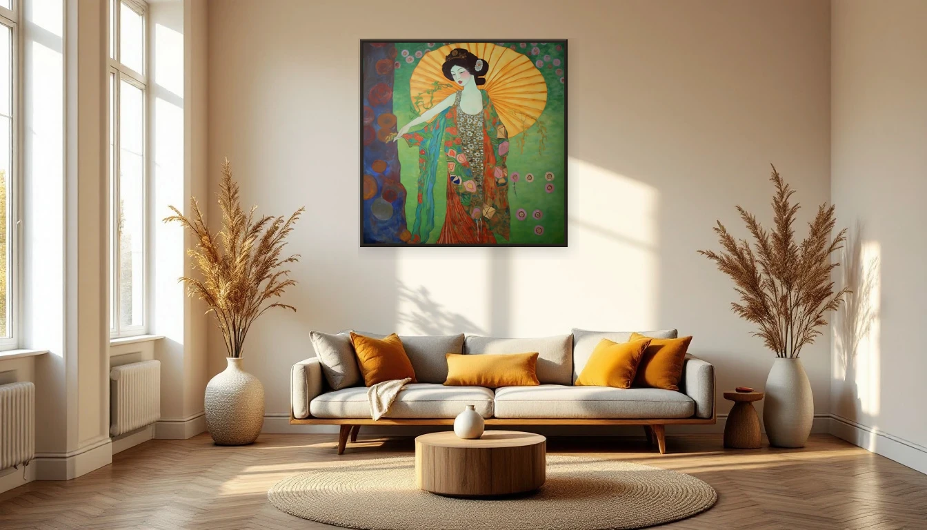
There is a shift happening. You can feel it in the morning light — that golden, amber glow replacing the sharp white of summer. In my studio, the change is unmistakable. My palette knife gravitates toward ochre, burnt sienna, deep terracotta. September has its own gravity.
The pull of the season
Every autumn, the same thing happens: my colour choices darken and warm without me thinking about it. The airy pastels and bright whites that felt so right in June suddenly seem too cool, too detached. The season asks for depth — and my brushes follow.
Your home feels this shift too. Those breezy summer cushions and light prints start to look a little out of place. What a room craves in September is visual warmth — not the thermostat kind, but the kind that wraps around you the moment you walk in. And that is exactly where art steps in.
Earth tones: the colour of belonging
The biggest interior trend this autumn? No surprise: warm earth tones are everywhere. Rich chestnut, olive green, mustard yellow, deep burgundy. Both Benjamin Moore and Pantone point the same direction this year — toward hues that feel like a warm embrace.
Abstract art is the simplest way to bring these tones into your space without repainting a single wall. One painting with warm ochre strokes above your sofa can completely shift a room's atmosphere. It becomes the anchor — the piece everything else orbits.
Art as a seasonal ritual
I believe your home should breathe with the seasons. The way you swap your wardrobe, you can let your walls evolve too. It does not have to be dramatic — sometimes moving one piece to a different wall is enough to see your space with fresh eyes.
Try this: look at the art in your home this week with intention. Does it still match how you feel? Does it work with the light that falls through your windows now? The beauty of abstract art is that it moves with your perception — the same warm tones that felt summery in July become enveloping and intimate in September.
Texture tells the story
One thing that stands out in the art world this season: texture reigns. Not smooth, flawless surfaces, but thick layers of paint, visible palette knife strokes, tangible matter. It fits autumn perfectly — a season that is itself full of texture. Think of the veins of a fallen leaf, the bark of an old oak, the rough weave of your favourite scarf.
In my own work, I chase that tactile quality deliberately. Layer upon layer, until the canvas almost breathes. If you were to run your fingers across the surface — please do not, but I understand the temptation — you would feel the story of its making.
Styling tip: the autumn corner
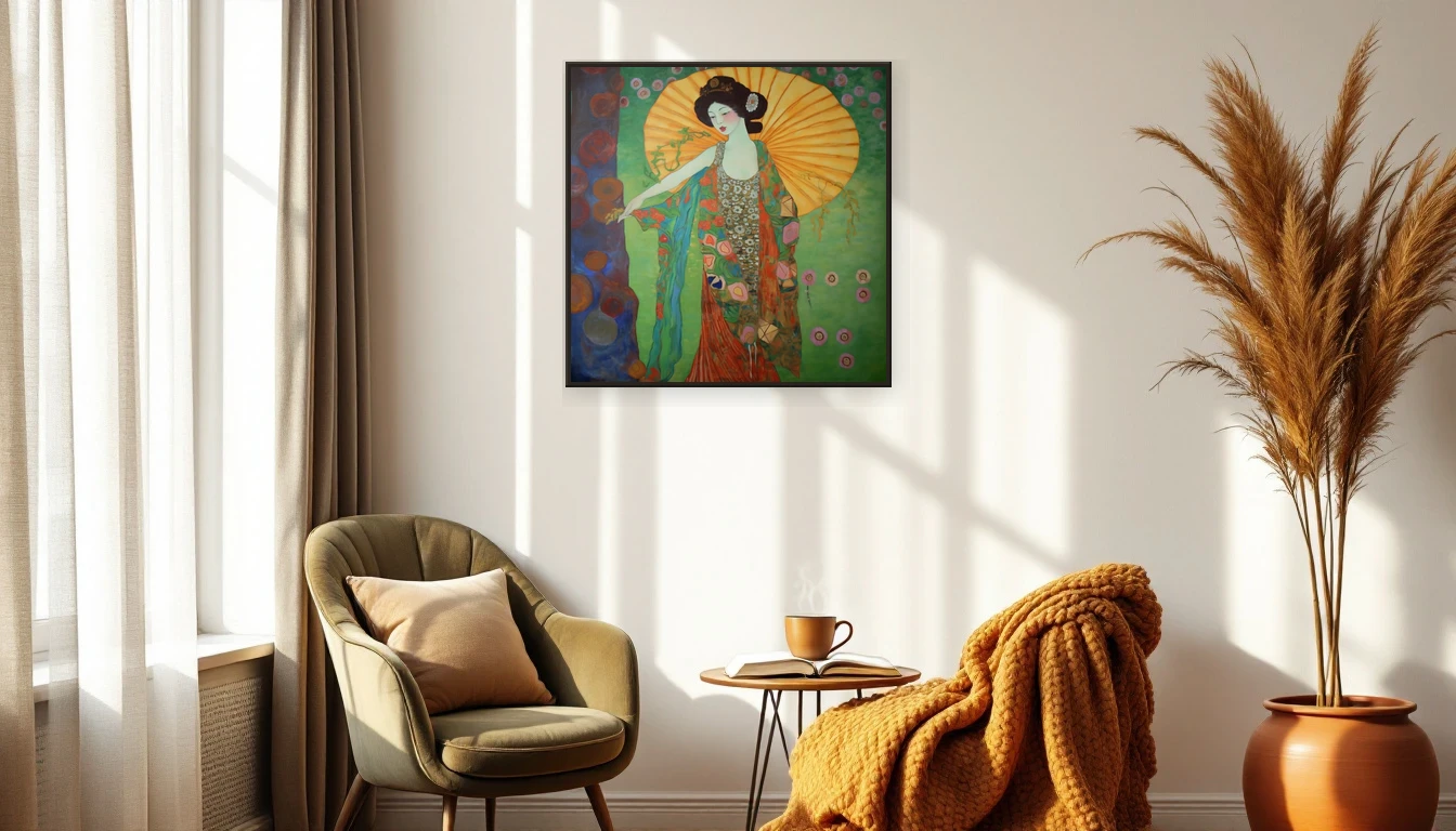
My favourite way to bring the autumn mood indoors: create one corner that embodies the season. An abstract painting in warm tones, a dried botanical branch beside it, a stack of wool throws and perhaps a ceramic vase in an earthy shade. No full makeover — just one spot where your eyes can rest.
The art is the centrepiece, quite literally. It pulls everything together, gives the corner a soul. Without the painting, it is a collection of objects. With it, it is a story.
Ready for autumn?
Explore the DNH collection and discover which piece completes your autumn home. Or get in touch — I love thinking along about the perfect work for your space.