
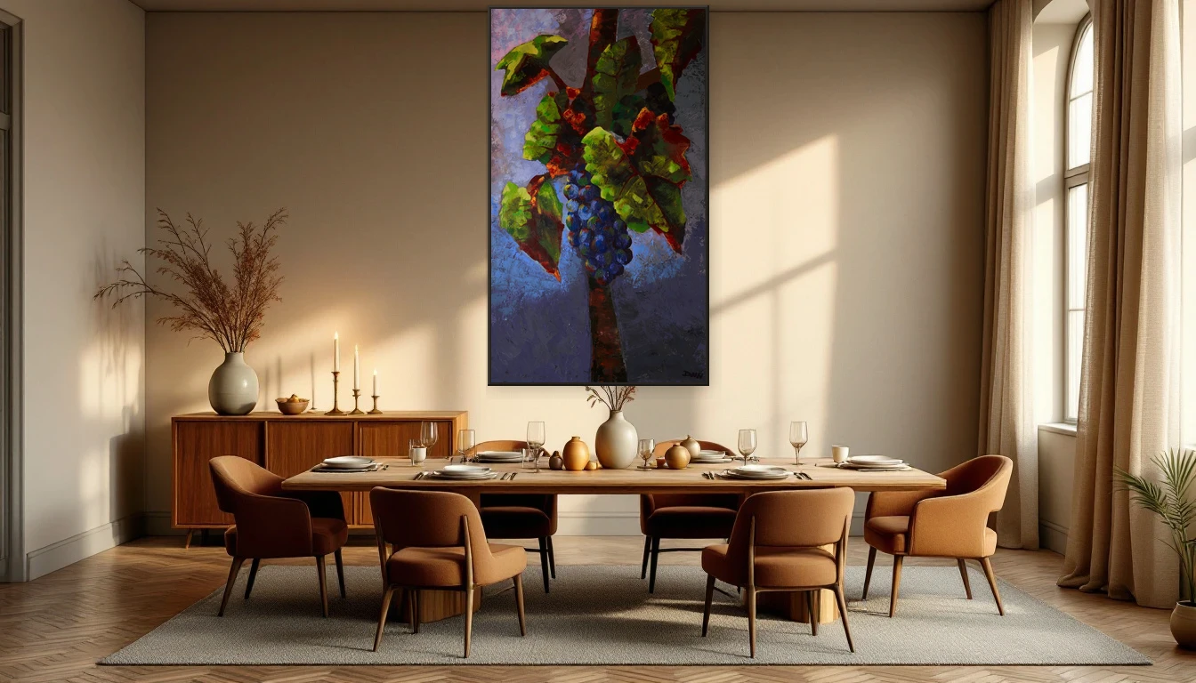
We spend hours choosing the right dining table, the perfect chairs, the ideal pendant light — and then leave the most visible wall in the room completely bare. If your dining room feels like it is missing something, it probably is: art.
The Wall You Forgot
In my studio, I notice it every day. When I look up from my work during a coffee break, what I see on the wall across from me shapes my entire mood. Your dining room works the same way. That stretch of wall behind the head of the table or above the sideboard is prime real estate — and in most homes, it goes unclaimed.
The dining room is having a serious renaissance in 2026. Design publications from Homes & Gardens to Living Etc. are documenting a shift toward more personal, lived-in eating spaces. Gone is the sterile, barely-used formal dining room. In its place: an eclectic, curated space where meals become rituals and the table is the heart of the home. Art is what gives that space its soul.
Colour You Can Almost Taste
Here is something restaurants have understood for decades that most homeowners overlook: colour directly affects how you experience food. Warm tones — the burnt umber, deep burgundy and gold that define this autumn's palette — stimulate appetite and create a sense of warmth that makes people want to linger. Cooler shades like blue and grey can actually suppress hunger.
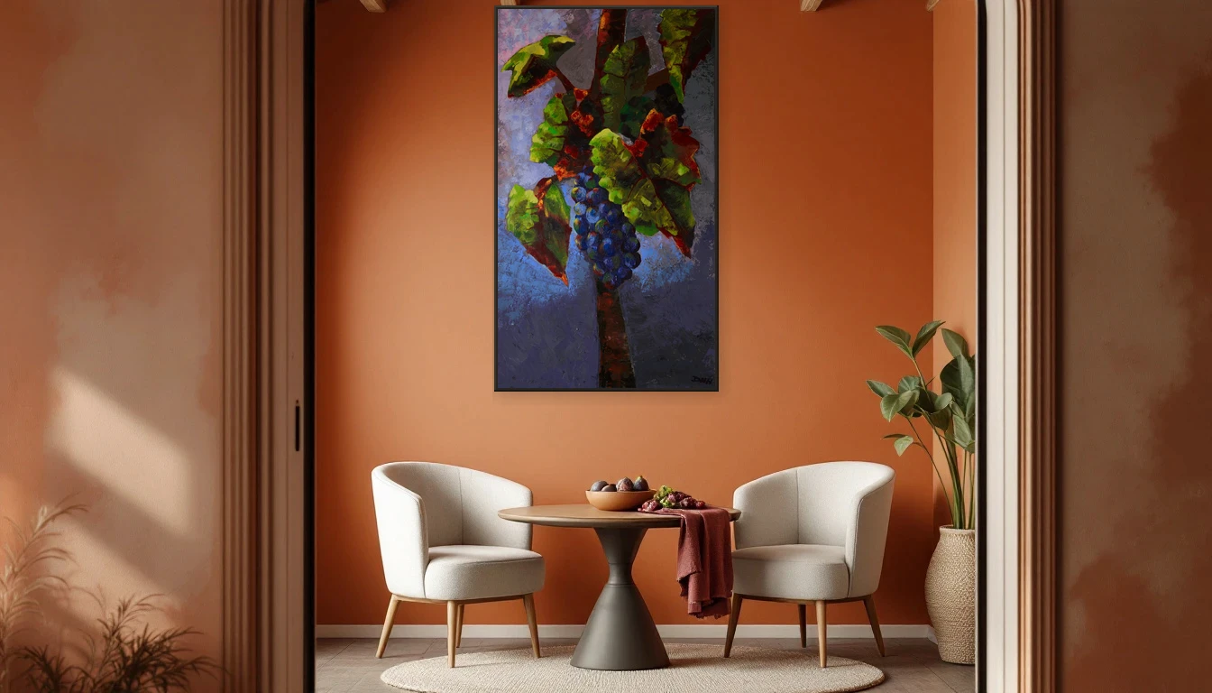
The colour story of autumn 2026 is richer and more saturated than anything we have seen in recent years. Think olive green, caramel, deep wine-red — colours drawn from old-growth forests and sun-warmed earth. An abstract painting in these tones above your dining table acts like a visual tablecloth: it sets the mood before the first course is even served.
The Conversation Piece
There is a practical reason why art works so well in dining rooms beyond aesthetics: it sparks conversation. At the table, your gaze lifts, your eyes wander, and there it is — a painting that gives your guests something to talk about beyond the usual small talk. Environmental psychology research shows that art with organic forms and warm colours actually encourages people to stay at the table longer. That is exactly what you want during a good dinner.
And it does not need to be complicated. One strong piece in the right spot does more than a salon-style arrangement of small frames. The rule of thumb: choose a painting that spans roughly two-thirds the width of your table. Large enough for impact, restrained enough not to overwhelm.
Seasonal Styling at the Table
Something I love doing — and always recommend to my clients — is letting the styling around a painting shift with the seasons. As autumn arrives, I pair warm-toned artwork with muted linen napkins, a few branches of eucalyptus in a ceramic vase, and candlelight. The painting stays as the anchor; the accessories evolve around it.
This is very much in line with the 2026 design direction: interiors are becoming more layered and personal. Handmade ceramics, textured linens, artisanal pottery beside your plate — these are elements that create a dialogue with the art on your wall. Together, they turn a table from a place where you eat into a place where you belong.
From Meal to Moment
Perhaps that is the essence of it: art in the dining room elevates a daily routine into a conscious experience. It asks you to pause, to notice the moment — the meal, the company, the light falling across the canvas.
Curious which piece would suit your dining room? Browse the DNH Artful Living collection or get in touch for personal advice. Because every table deserves a painting that joins the conversation.
Practical Pointers
Hanging height: Centre the artwork at seated eye level — lower than you would in a living room. Around 130–140 cm from the floor works well.
Lighting: Warm light (2700K) brings out the colours in your painting and creates an intimate atmosphere.
Material matters: Choose an original painting with texture. The interplay of light and shadow across a real canvas adds a richness no print can match.
Colour harmony: You do not need to match — you need to resonate. Pick a piece whose undertones echo in your tableware, your linens or your upholstery.