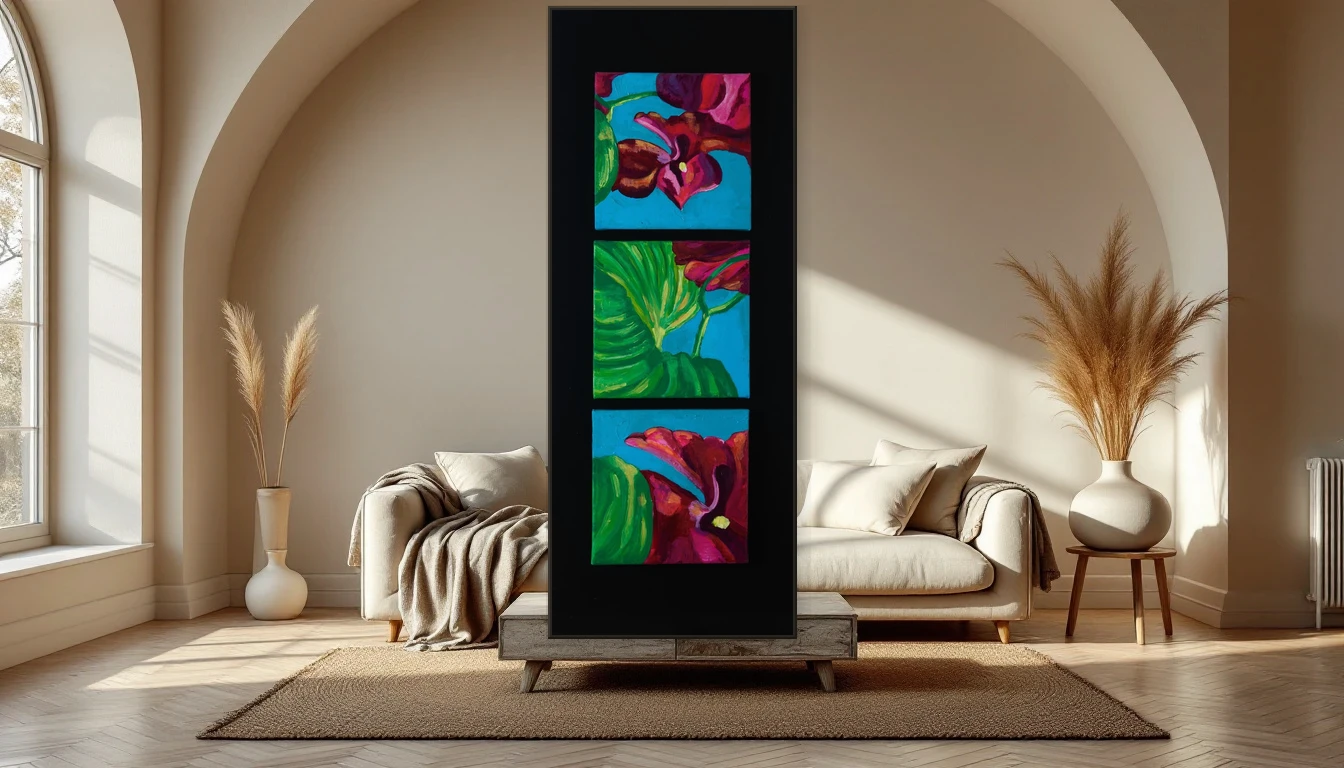
There’s something about a painting that makes you want to reach out and touch it. I see it happen in my studio all the time — a visitor’s hand drifting toward the canvas before they catch themselves. It’s the ridges, the valleys, the visible history of the palette knife. Texture does something that colour alone cannot: it pulls you physically closer.
Why 2026 Is the Year of Touch
After years of flat prints and pixel-perfect minimalism, the design world is pivoting hard toward the tactile. Interior designers are choosing art with physical presence — impasto layers, palette knife work, raw pigment on linen. The numbers tell the story: artisan craftsmanship searches are up 21 percent, and custom framing interest has surged over 300 percent. In a world lived increasingly through screens, we’re hungry for surfaces that exist in three dimensions.
Research backs the instinct. Tactile-rich environments measurably reduce stress and improve wellbeing. The texture on a canvas isn’t just aesthetic — it’s physiological. It grounds you in the present the way a smooth screen never can.
The Story Inside the Paint
Look closely at an impasto painting. Every layer tells you something. Here the artist pressed hard, confident and decisive. There she built slowly, letting the layer beneath breathe through. A scratch through wet paint. A mark that was allowed to stay. These aren’t mistakes — they’re decisions made visible. They turn a painting into a diary of its own creation.
In my own practice, texture is never secondary. It’s the point. I work with thick acrylic layers, sometimes mixed with sand or dust from my garden. The surface of a canvas matters as much as the colour — it determines how light falls, how shadows shift through the day, how the work lives and breathes in a room.
Wabi-Sabi: Finding Beauty in the Imperfect
The Japanese philosophy of wabi-sabi — embracing imperfection, impermanence, and incompleteness — has found its perfect moment in 2026 interiors. Forget symmetry. Forget the curated grid. A painting with visible brushwork beside a weathered oak table and a hand-woven throw — that’s what gives a space its soul.
Textured abstract art belongs here naturally. It is imperfect by definition, unique by nature. No two paint layers are the same. No two canvases identical. That’s not a limitation. That’s the entire point.
Texture and Light: A Conversation That Never Ends
A textured painting is never the same twice. Morning light catches the raised ridges and casts micro-shadows that create depth you didn’t see yesterday. Midday flattens everything into bright clarity. Evening lamplight turns those same ridges dramatic and moody. It’s three paintings for the price of one — and the show changes daily.
How to Style Textured Art
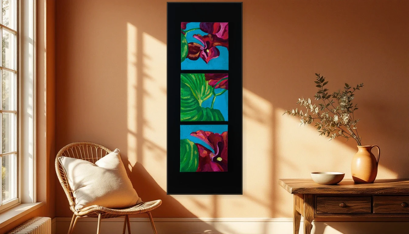
The golden rule: let the texture do the talking. Mount a textured abstract piece against a quiet, neutral wall — matte white, warm grey, or soft lime plaster. Surround it with materials that echo the tactile quality: linen, raw timber, stoneware, woven rattan. Keep competing patterns minimal. The painting is the protagonist; everything else is the stage.
Height matters too. Hang at eye level so you catch the shadow play when light hits from the side. Too high, and you lose the relief entirely.
A Quiet Protest Against the Smooth
In a world growing sleeker and more digital by the day, a painting with physical texture is a small act of resistance. It says: someone here values the real over the rendered. Finds an imperfect brushstroke more compelling than a polished pixel. Understands that a home should not just look good, but feel good under your gaze.
Curious about works with texture and depth? Explore the DNH collection and discover which piece speaks to your space. Or get in touch — I’d love to tell you about the texture, the process, and the story behind each work.