
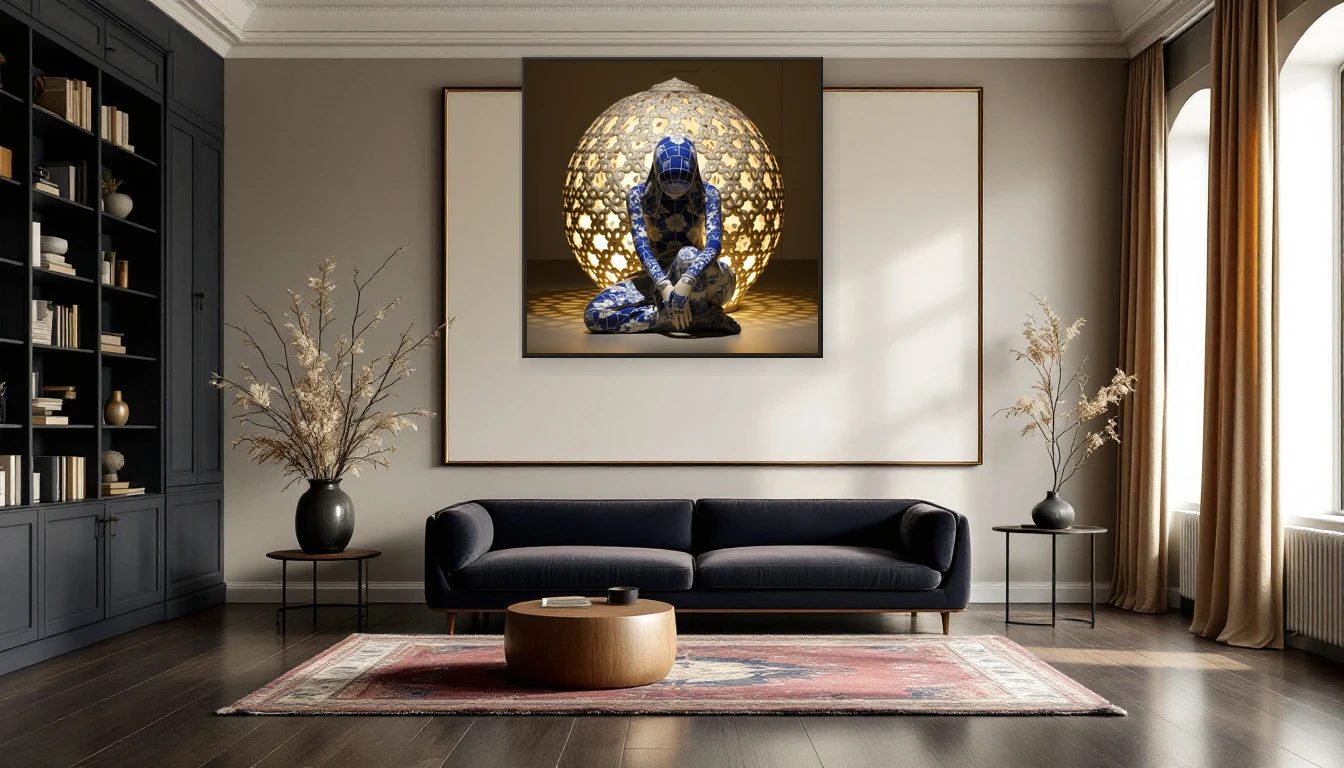
The other afternoon, with dusk already falling at four o'clock, I stood in my studio looking at a painting on my easel. Deep cobalt layers, porcelain-white accents catching the fading light. And I thought: this piece would only truly come alive against a dark wall. Not safe white. Something bolder.
The Moody Revolution
The interior world is shifting. After a decade of Scandinavian minimalism and all-white everything, the pendulum has swung firmly toward depth. Dulux named three shades of deep blue — the Rhythm of Blues collection — as their 2026 Colours of the Year. From midnight navy to muted indigo, the message is clear: darkness is not the absence of light, it is a design choice for emotional depth.
And blue is just the beginning. Burgundy, forest green, warm charcoal, deep aubergine — what designers call moody neutrals are appearing in living rooms, bedrooms and even kitchens across Europe. Elle Decoration, Architectural Digest, and every major interiors platform agree: dark interiors are not gloomy. They are enveloping.
The Psychology of Cocooning
There is real science behind the appeal. Darker colours trigger what researchers call the cocooning effect — a sense of shelter, intimacy and safety. Your brain reads a dark-walled room as an embrace. In a world that keeps getting louder and faster, a moody interior offers a genuine refuge.
This is exactly why art against a dark wall works so powerfully. The contrast draws your eye straight to the piece. Colours intensify, details sharpen, emotional impact grows. An abstract work that reads as quietly present on a white wall becomes magnetic against midnight blue or deep graphite.
When Porcelain Blue Meets the Dark Wall
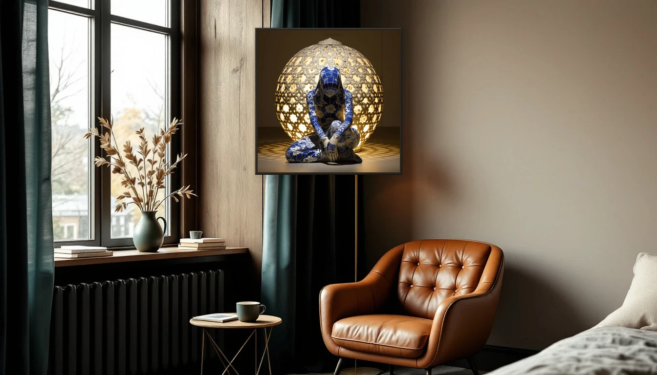
In my own practice, I notice this effect most with pieces from the Delft Blue collection. The deep cobalts and porcelain-white highlights take on an almost luminous quality against a rich, dark background. It is as if the work starts glowing from within.
This is no accident. The old Delft masters understood it instinctively: blue on white is beautiful, but blue beside darkness is breathtaking. I chase that same tension in my mixed-media pieces — layers that suggest depth, hues that shift with the changing light throughout the day.
The Dark Academia Connection
There is a cultural current at play too. The dark academia aesthetic — rich materials, warm woods, intellectual atmosphere — has lowered the threshold for dark interiors. The conversation is no longer about minimalism versus maximalism. It is about mood. A velvet sofa in aubergine, a wall in midnight blue, and between them an abstract artwork that holds the room together.
How to Start
You do not have to paint your entire living room tomorrow. Start with a single accent wall — the one your eye naturally travels to. Choose a shade that speaks to you: deep teal, warm graphite, or the inky indigo from the Dulux Blues range. Then hang a piece that creates contrast: warm tones against cool walls, or a tone-on-tone play for that full cocoon feeling.
Pay attention to light. A dark wall asks for warm, directional lighting — a picture light above the work, or a floor lamp angled to graze the canvas. The difference is dramatic: the art becomes the focal point, the wall a fluid backdrop.
The Courage of Colour
Perhaps the most beautiful thing about a dark interior is the intention behind it. It is a deliberate choice for atmosphere over brightness, for feeling over convention. And art — your art, chosen with your heart — becomes more than decoration in that setting. It becomes the beating heart of the room.
So dare the dark. Not because it is trendy, but because it feels like coming home.
Curious which piece from the collection suits your moody wall? Browse the Delft Blue collection or get in touch for personal advice.